Art in all forms has the power to inspire, provoke thought, and stir emotions. The beauty and intricacy of artwork can only be fully appreciated when it's displayed under the right lighting conditions. Lighting plays a pivotal role for color perception in art, particularly when it comes to the interplay between warm, cool, and neutral lighting and their effects on artwork, as well as understanding what color temperature for artwork may be ideal.
Lighting Tips for Displaying Artwork: Key Takeaways
-
Understand Color Temperature (Kelvin Ratings): Warm light (below 3000K) creates amber tones, while cool light (4000K-6500K) produces bluish tones.
-
Warm vs. Cool Lighting: Warm light can desaturate cool artwork colors, while cool light can dull warm tones, affecting color accuracy.
-
Color Theory and Lighting: Harmonizing ambient and art lighting colors prevents "washing out" effects, ensuring art displays vibrantly.
-
Optimal Lighting Temperature: 3000K is often ideal for accurate color rendering, offering a neutral, balanced glow that suits a wide range of art styles.
-
Adjustable Brightness with Dimmers: Control lighting intensity to highlight artwork details and maintain optimal contrast with ambient lighting.
-
Versatile Light Options: Color-tunable lights (like 2700K-4000K) allow customization to match both artwork and room ambiance, ensuring ideal illumination.
Color Temperature and Kelvin (K) Ratings
Color temperature, often measured in kelvins (K), refers to the warmth or coolness of a light source. It's a critical factor in determining how colors appear in both art and everyday life. Understanding color temperature is essential when it comes to displaying artwork.
Light sources with lower kelvin ratings, typically ranging below 3000K, emit warmer, amber-hued tones reminiscent of candlelight or the soft glow of a setting sun. These warm hues create a cozy and inviting atmosphere.
Light sources with higher kelvin ratings, typically ranging from 4000K to 6500K, produce cooler, bluish tones reminiscent of direct daylight or overcast skies. These cool tones offer a sense of brightness and alertness, though may unfortunately impart a ‘sterile’ feel due to their use in clinical settings in addition to lower color rendering properties.
Warm Lighting vs. Cool Lighting and Artwork
The choice between warm and cool lighting can dramatically influence how artwork is perceived, particularly regarding color perception in art. The impact lies in how different lighting temperatures can affect the color accuracy of the art on display relative to our eyesight:
When warm lighting (lower kelvin) is used to illuminate artwork with cool color tones (blues, greens, purples), it can have a "washing out" or desaturating effect. The warmth of the light can reduce the visual intensity and vibrancy of cool colors, making them appear dull or muted. This can result in the artwork not being fully appreciated in its intended form.
Conversely, cool lighting (higher kelvin) used to illuminate artwork with warm color tones (reds, oranges, yellows) can “wash out” the warmth and richness of these hues. It can make warm tones appear less saturated and less vibrant than they truly are, therefore affecting the viewer's perception of the artwork.
Color Theory in Lighting
The “washing out” effect described above is something that is explained in color theory by the juxtaposition of warm and cool colors on the color wheel. The color wheel is a circular map of the colors that are visible to the human eye. This map denotes how these colors interact with one another. Colors that are directly opposite one another are called complementary colors. While displaying complementary colors side by side can have an intensifying effect, the mixture of these opposing colors will produce a muddied result. This is applicable to many mediums of artwork and other applications in daily life but is particularly notable in regard to art lighting.

With that point in mind, harmony in color temperatures between ambient lighting and art lighting is incredibly important. If the lighting in your home is warm 2700K and you introduce a cooler, higher kelvin light, you will notice the difference in color temperature as the colors displayed side by side will intensify each other. The same would be true of cooler ambient lighting in your home and introducing a warm art light: the opposing colors will be noticeable.
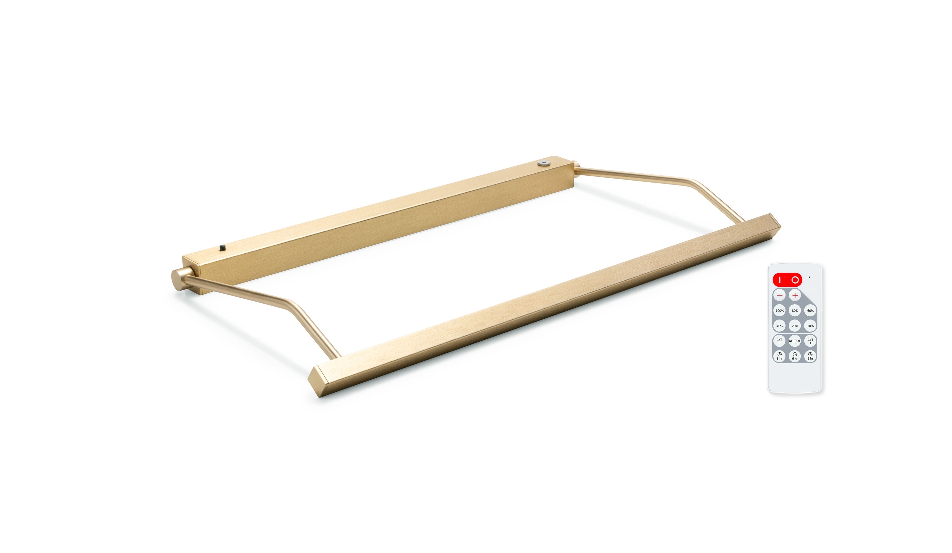
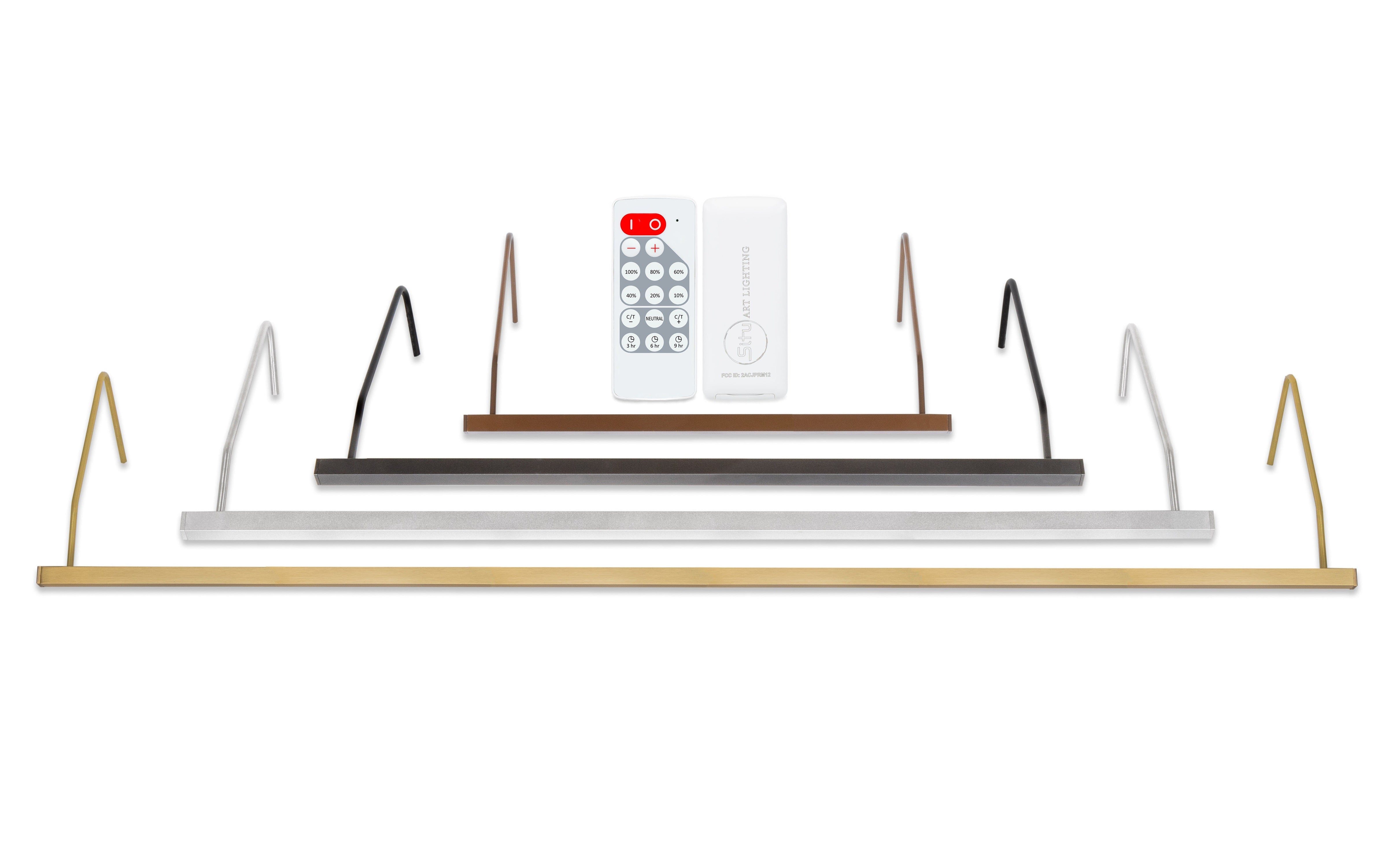
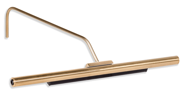
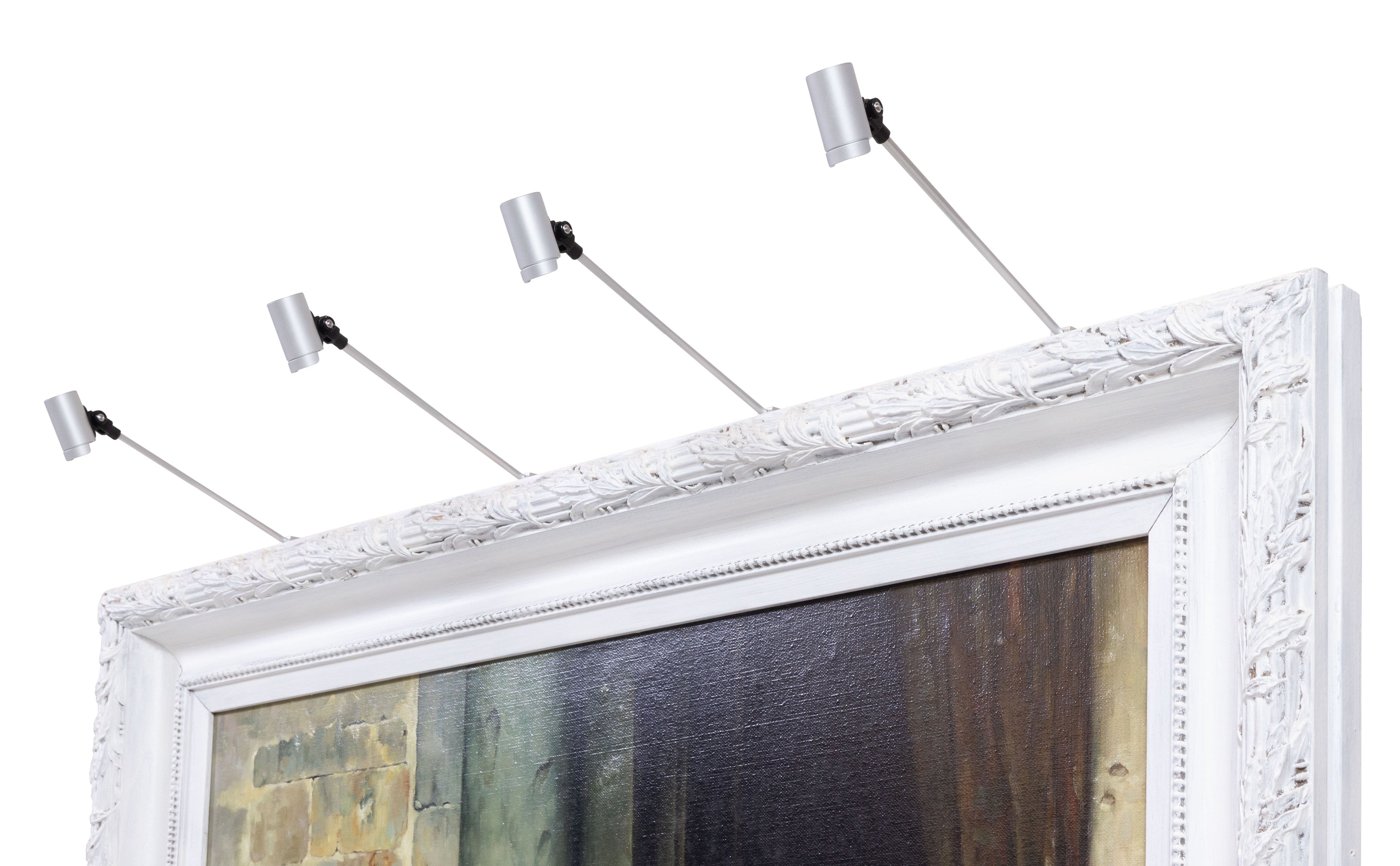
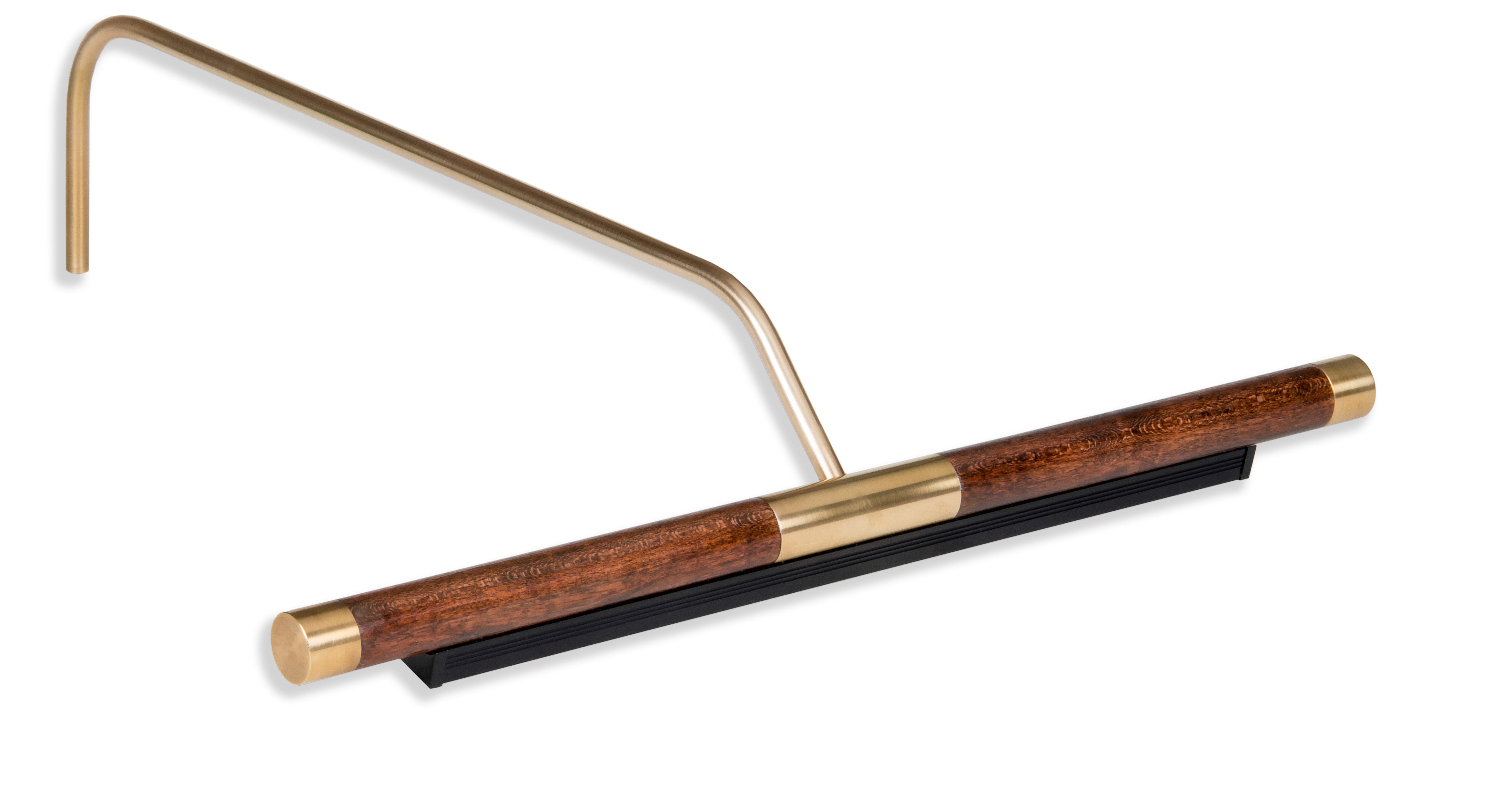
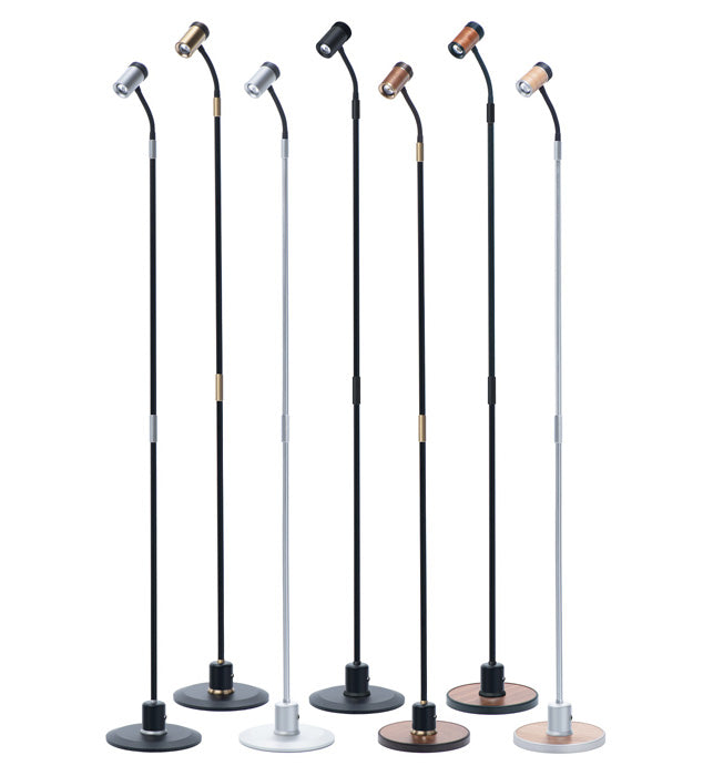
When considering illuminating artwork as directly layering the light over the colors of the piece, a more neutral tone of light is therefore often desired to bring out the best of all colors and tones without muddying or ‘washing out’ the artwork. Our newest color tunable Plug-in Vision Series offers the ability to browse through 7 steps of color accurate light from 2700K – 4000K via the included remote control, as does the Direct Connect Vision Series and the Rechargeable Vision Series. This allows you to see which color temperature is most cohesive with your artwork as well as your ambient lighting in real time. Nearly all of our other picture light fixtures are available in options of 3000K or 2700K to most closely match your lighting needs.
The Optimal Color Temperature for Art Display: 3000K
Achieving the right balance between warm and cool lighting is crucial for displaying artwork accurately. While there's no one-size-fits-all answer, 3000K is often considered an optimal color temperature for illuminating artwork. Here's why:
- Neutral Illumination: A 3000K light source provides a relatively neutral illumination that doesn't overly bias warm or cool colors. It strikes a balance between the cozy warmth of lower kelvin ratings and the brightness of higher kelvin ratings.
- Enhanced Color Accuracy: The 3000K color temperature enhances color accuracy by preserving the true colors of the artwork. This allows viewers to appreciate the artist's intended palette and the nuances of the piece.
- Versatile Appeal: 3000K lighting is versatile and works well with a wide range of artistic styles and mediums. Whether you're displaying oil paintings, watercolors, sculptures, or photographs, this temperature provides a suitable backdrop.
- Viewer Comfort: It also creates a comfortable viewing experience, neither too warm nor too cool, ensuring that the artwork remains the focal point without causing visual discomfort.
Dimmers and Art Lighting Control
In addition to selecting the right color temperature, adjusting the brightness of your art lighting can further enhance the display of artwork. Dimmers allow you to adjust the intensity of the lighting, fine-tuning the ambiance to match the artwork and the mood of the space. This control is especially valuable for highlighting specific details or creating a captivating focal point within an art collection. Adjustable brightness is a requirement for the best enjoyment of your artwork, as the ability to balance lighting against ever changing ambient brightness is invaluable. When you have a light at a fixed brightness, one may find that it is too bright or too dim for certain use cases. Art lighting should ideally be 25% brighter than the ambient lighting to give your artwork the right glow or ‘pop’ required.
In conclusion, lighting is an art form in and of itself when it comes to displaying artwork. The choice between warm and cool lighting can significantly impact how colors are perceived, potentially affecting the viewer's appreciation of the art. Striking the right balance with a color temperature of around 3000K is often the key to showcasing artwork accurately and allowing it to shine. So, the next time you seek to illuminate your artwork, remember that the right lighting can unlock its true potential, inviting viewers to connect with the artist's vision on a deeper level.