A gallery-worthy display is not a function of square footage or budget. It is a function of decisions. Which pieces to show, how to group them, where to place them, how to frame them, and how to light them. Get those decisions right and a single painting in a hallway can carry more presence than a wall of casually arranged prints in a larger room. This guide covers the decisions that matter most.
Start With a Curatorial Perspective
Galleries do not hang everything they own. The discipline of selection is what gives a display authority. Before deciding where anything goes, decide what belongs together. Pieces that share a palette, a period, a medium, or a subject can coexist comfortably even when they differ in scale. Pieces that have nothing in common tend to compete rather than converse.
A single cohesive grouping of three or four works will consistently outperform a larger collection arranged without a unifying logic. Restraint is not a limitation; it is the mechanism by which individual pieces gain presence. If you have more work than wall space, rotate it. Galleries do.
Choose the Right Wall Before You Hang Anything
The wall determines everything that follows. A strong display requires a wall that naturally draws the eye: the wall opposite the main entrance to a room, the wall behind a primary seating arrangement, the wall at the end of a hallway, the wall above a fireplace or significant piece of furniture. These positions give artwork a visual destination. A piece hung on a wall that nobody naturally looks at is invisible regardless of its quality.
Avoid walls that are broken by too many doorways, windows, or switches. The interruptions divide attention and make compositional coherence difficult to achieve. A single uninterrupted surface, even a modest one, will support a stronger display than a larger wall riddled with architectural interruptions.
Hang at the Right Height
The near-universal standard in professional gallery installations is a centerline of 57 to 60 inches from the floor to the center of the artwork. This places the visual center of the piece at average standing eye level, which is where the eye lands naturally when entering a room or approaching a wall. Hanging higher than this forces the viewer to look up; hanging lower makes the work feel grounded to the floor rather than present in the room.
The exception is artwork hung above furniture, where the relationship between the piece and the furniture below it takes precedence. In those cases, leave 6 to 8 inches between the top of the furniture and the bottom of the frame, and let the furniture anchor the composition rather than eye level. The same principle applies to artwork hung above a fireplace. The mantel sets the visual floor, and the piece should read as part of that arrangement rather than floating above it independently.
Give the Work Room to Breathe
Negative space is not wasted space. The wall around a piece is part of the composition. A painting given adequate surrounding space reads at its full scale and communicates that the owner understands its value. A painting crowded by adjacent objects, other frames, or furniture pressed too close loses visual authority and begins to read as decoration rather than artwork.
As a general orientation: the space between grouped pieces in a gallery arrangement should be consistent and relatively tight, 2 to 4 inches between frames creates compositional cohesion. The space between the grouping as a whole and surrounding furniture or architectural features should be more generous, enough that the eye registers the group as a distinct zone within the room.
Frame With Intention
Framing decisions either amplify a work or compete with it. A frame that draws attention to itself is a frame that is working against the piece. In most residential contexts, simple profiles in natural wood, black, white, or metal read cleanly and recede appropriately. Elaborate decorative frames belong with work from a period where they are contextually appropriate, not applied broadly as a style choice.
Consistency across a grouped display strengthens the arrangement. Frames need not be identical, but they should share some logic: similar profiles, similar tones, or a deliberate contrast that holds together as a choice. A mix of unrelated frames reads as indecision rather than eclecticism.
Light the Work, Not the Wall
Everything above matters and none of it reaches its potential without appropriate lighting. General room lighting was not designed for artwork. Recessed downlights, overhead fixtures, and ambient lamps produce flat, undifferentiated illumination that flattens tonal relationships and fails to direct the viewer's attention toward the work. A piece that looks compelling in a gallery or at auction will look considerably less alive under general room lighting, not because anything is wrong with the piece but because the light source is doing the wrong job.
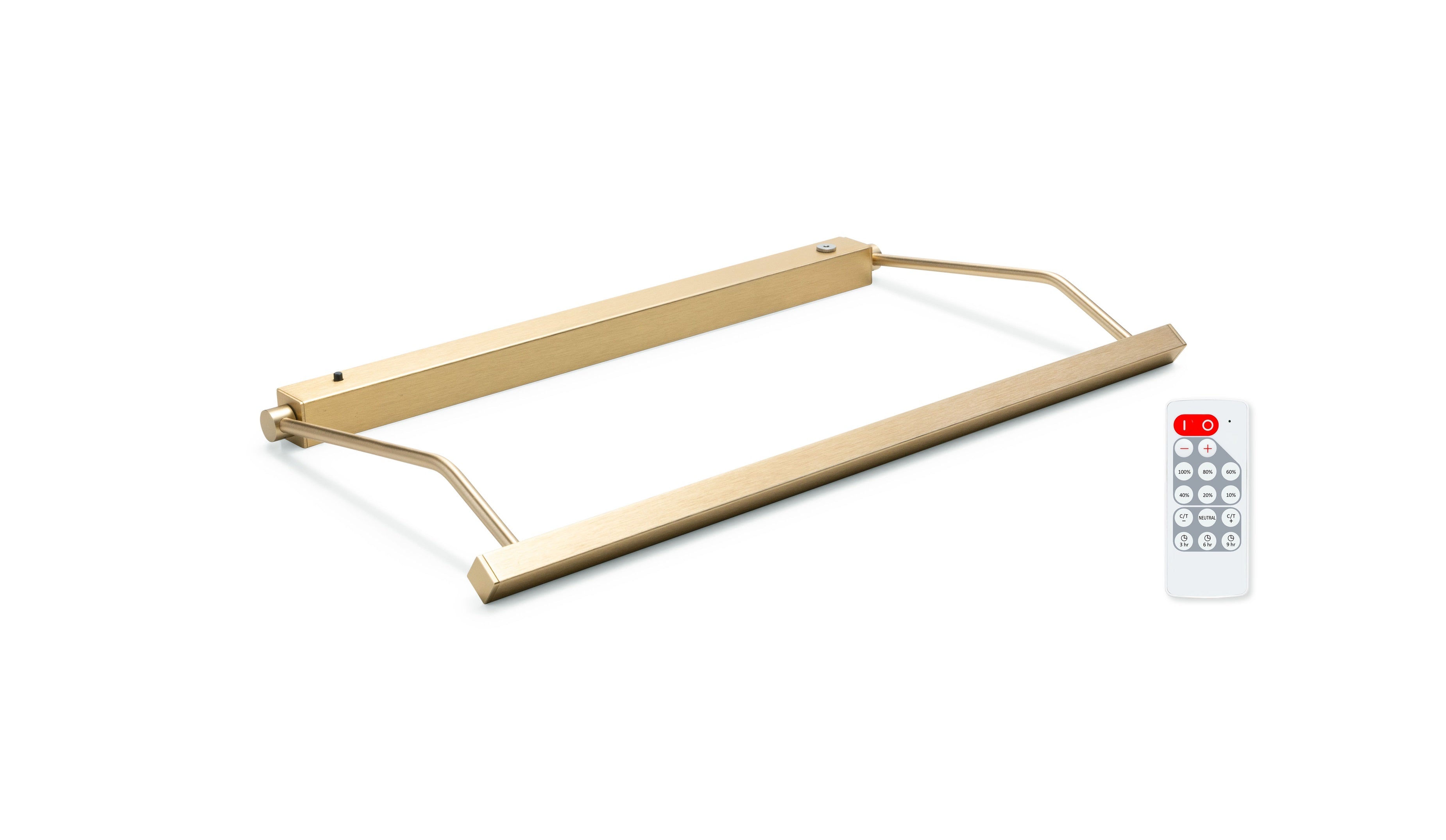
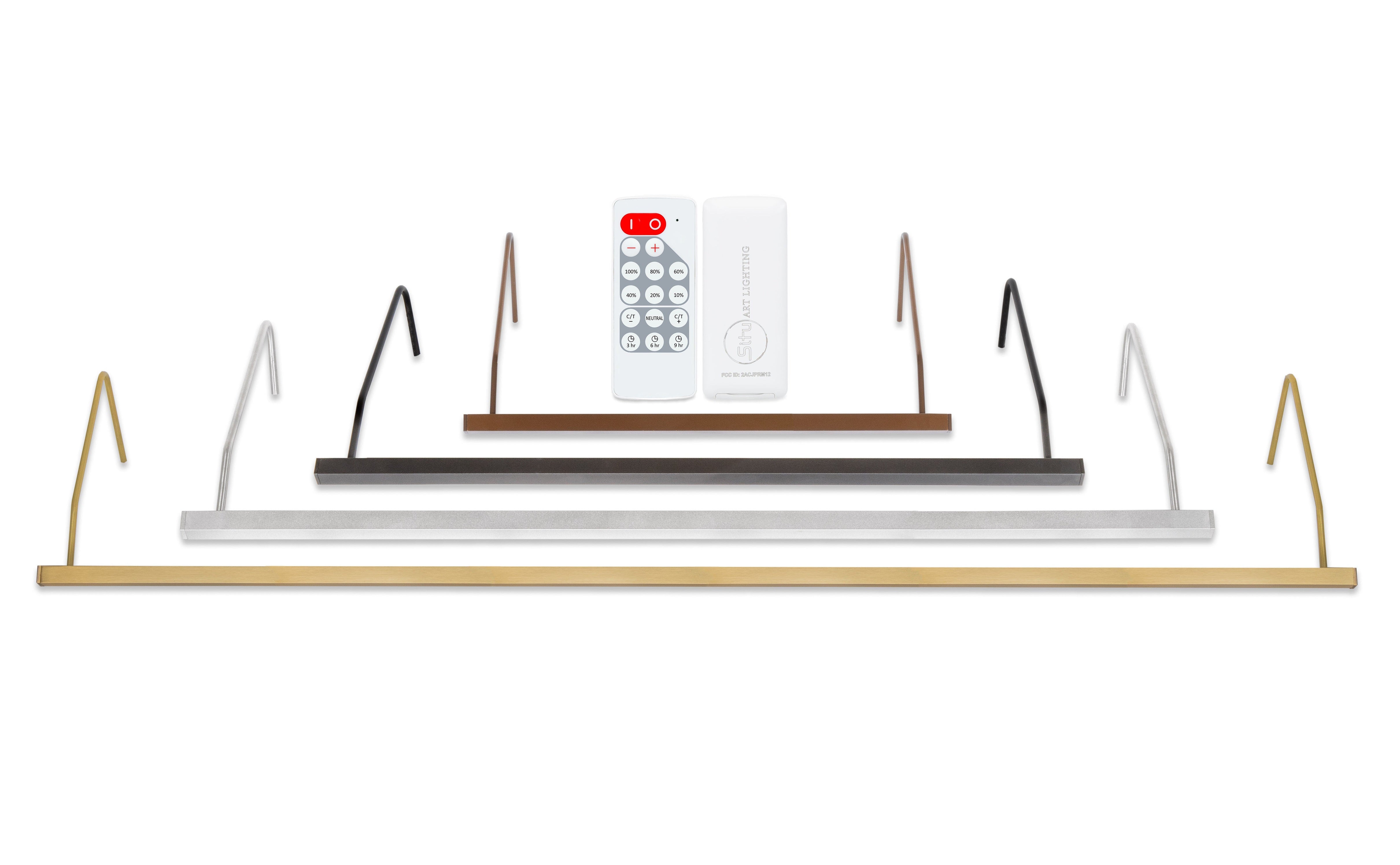
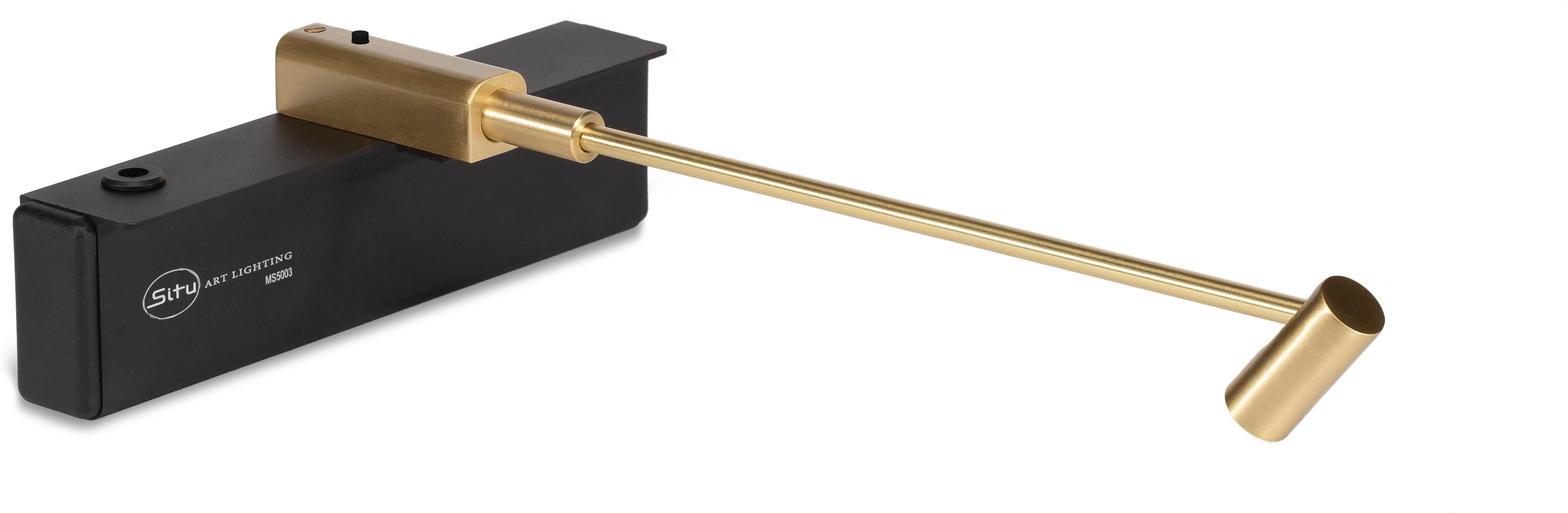
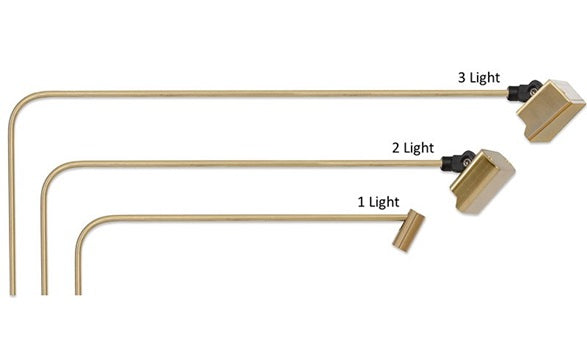
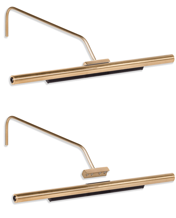
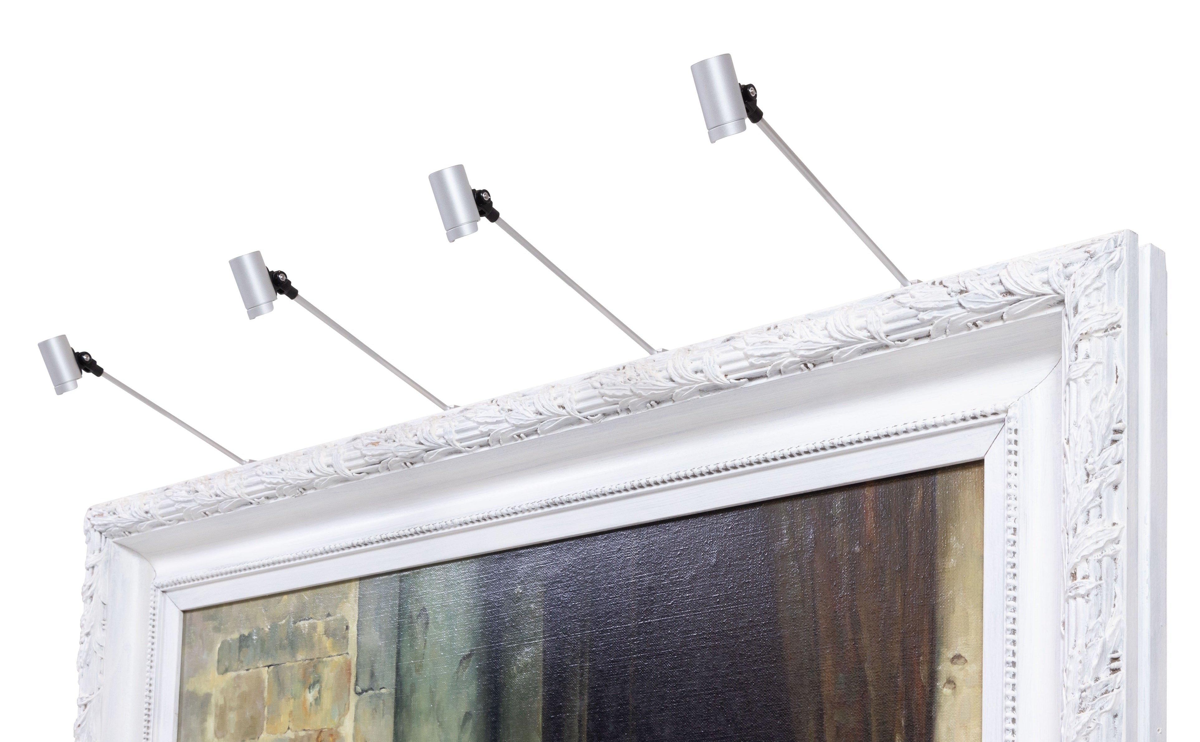
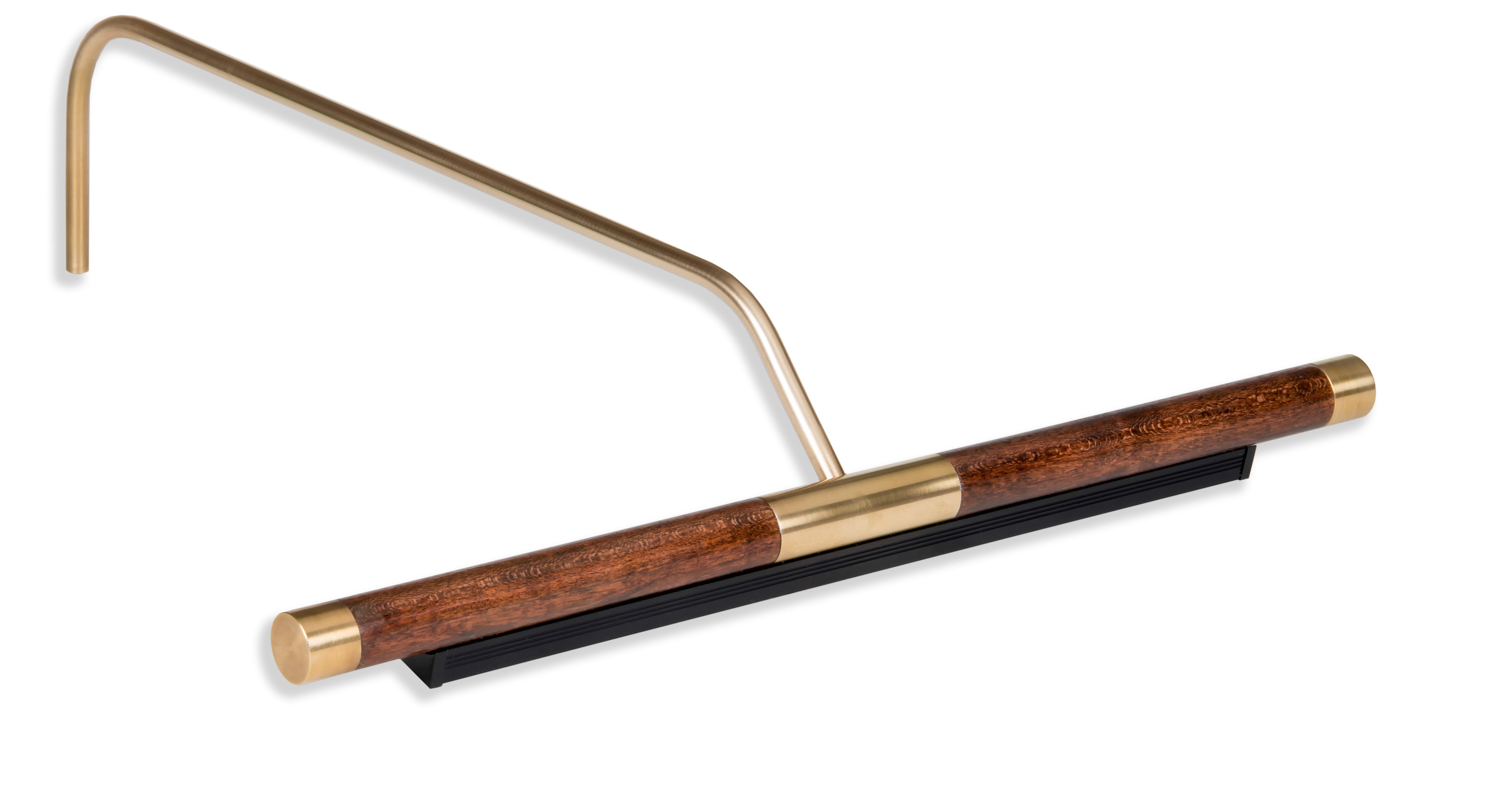
Dedicated picture lighting changes this completely. A well positioned plug-in LED picture light directs high CRI illumination precisely across the canvas surface, revealing color with the accuracy the medium deserves, rendering surface texture, and creating the visual separation between the artwork and the wall that makes a piece command attention. The difference is not subtle. Collectors who make the transition from room lighting to dedicated picture lighting consistently describe it as seeing their work for the first time.
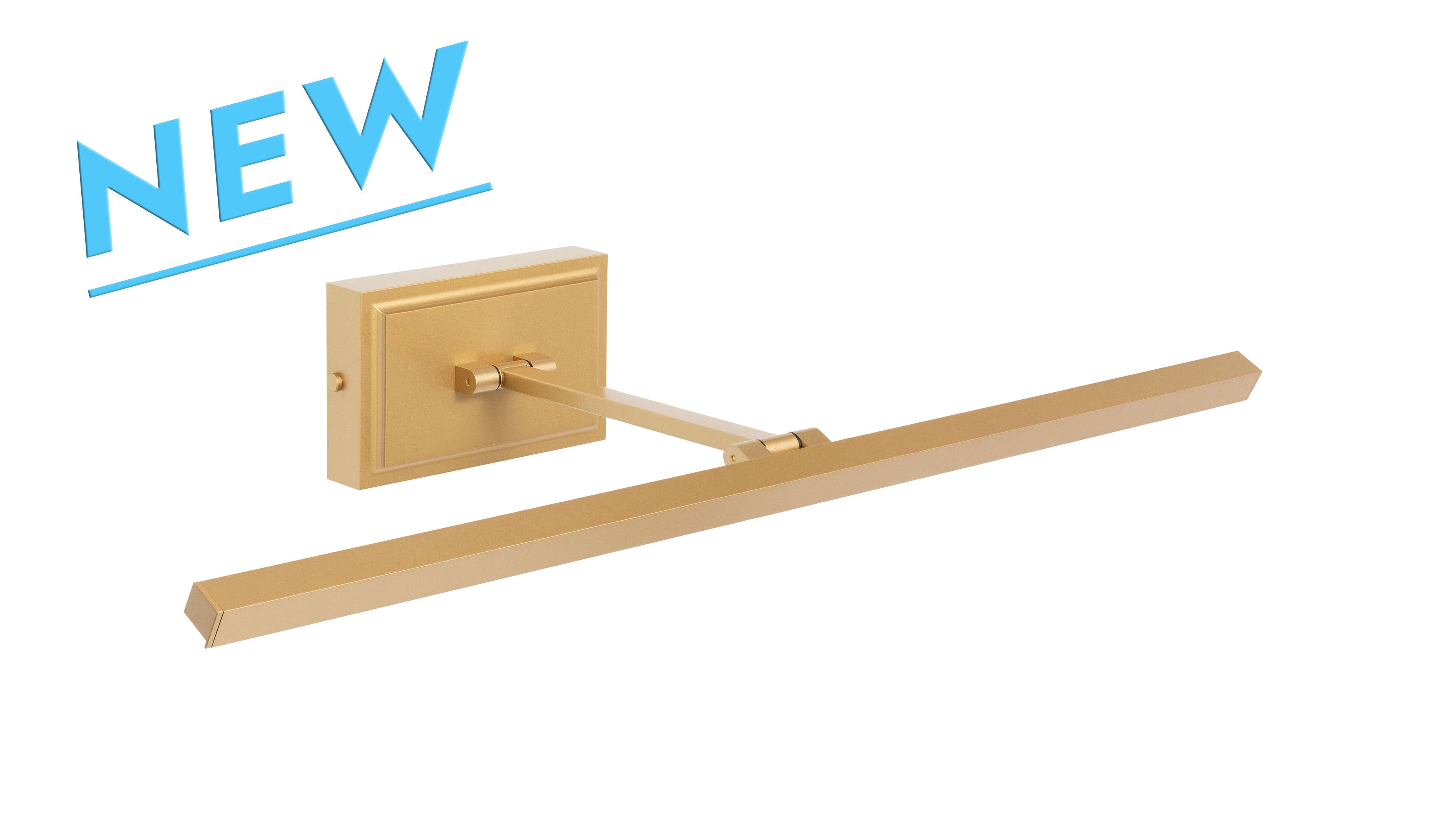
Plug-in picture lights connect to a standard outlet and require no wiring beyond the cord that runs from fixture to wall. That makes them the most accessible starting point for most residential installations: the fixture mounts above the frame, the outlet is placed behind the artwork, the cord is then managed discreetly, and the piece is properly lit. For collectors who prefer no cord at all, wireless rechargeable fixtures remove that variable entirely. For installations that call for wall dimmer or smart home integration, hardwired fixtures are the appropriate choice. The format is an installation decision, not a quality one; the optical performance is the same across all three.
Match the Light to the Medium
Color temperature is the variable most collectors underestimate. Warm-toned oil paintings and works with rich earth pigments tend to read best under sources in the 2700K to 3000K range. Photography, contemporary work, and cooler palettes generally suit 3000K to 3500K better. A source mismatched to the medium shifts the color reading of the work in ways the viewer may not consciously identify but will feel. For collectors with varied collections, color-tunable fixtures offer the flexibility to adjust across a range, typically 2700K to 4000K, without changing the fixture. The best available options maintain 95+ CRI across that full range, which means color accuracy is preserved at every setting.
Audit the Display Before Considering It Finished
Once the work is hung and lit, view it from every position in the room where it will be seen. Sit in the primary seating arrangement and look at it. Walk past it the way someone entering the room would. Stand at the natural viewing distance and assess the coverage and color rendering of the light. Check for glare on any glazed pieces from multiple angles and positions.
This is also the moment to assess the relationship between the display and its environment. Does the surrounding furniture support the work or compete with it? Does the ambient light in the room work with the dedicated picture lighting or against it? Are there other focal points in the space that draw the eye away from the display at moments when the display should be primary?
A gallery worthy display is not a single decision made once. It is a set of decisions made in relation to each other, evaluated together, and adjusted until the whole reads as intended. Curation, placement, framing, and lighting are each necessary. None is sufficient alone.
If you are working through these decisions for a specific space and would benefit from a specialist's perspective, our team is here to help. Share the artwork, the wall, and the installation constraints and we will identify the right plug-in LED picture light for your space. Thousands of collectors, designers, and institutions trust us to get it right.