Choosing the correct art lighting is about more than the importance of selecting a picture light or whether to use LEDs. A key decision involves what finish to select for your fixture.
The impact made and satisfaction derived from gazing at your artwork should not be diminished by a fixture finish that detracts from your artwork – whether painting, tapestry, or picture. Enhance your investment by making the right decision when you ask: what finish should I select for my fixture?
Let’s take a look at the key considerations in choosing the finish of your art lighting:
- Determine the following: do you want the art light to blend in or stand out? Is the home more modern (cool tones) or traditional (warm tones)?
- If you’d like the art light to blend in, pick the closest match to the color of your frame or artwork if frameless.
- If you’d like the art light to stand out, pick an accent color that is often used in the room like Brushed Brass or Silver.
Discreet or Eye-Catching Lighting
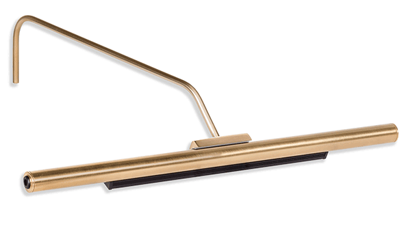
An important place to start is whether you want your fixture to stand out, or whether you want it to blend in, almost becoming invisible. If you’re looking for a discreet presentation, that can lend itself to choosing a fixture that matches the frame of the artwork or the tones of an unframed piece. Our antique bronze is a great option to blend with a traditional wood frame.
For those who want the picture light to stand out, matching the fixture to nearby décor as opposed to the frame can provide for this effect. Options such as these will highlight the art lighting without taking away from the beauty of the artwork itself.
The bottom line is: Do you want your art light “hidden” or would you like to show it off?
Style of the Room’s Decor
The style and color of your light fixtures play into your room’s décor. You may want to choose a picture light that is similar to the frame, the wall color, the flooring, other fixtures, or the furniture. It’s not always easy to match identically, unless it’s a simple black or brown, so an alternative choice is a complementary color that will pair well with the rest of the decor.
If your room is minimalist in design, such as monochrome whites and grays, then a color that adds natural variation may work: think brass or black.
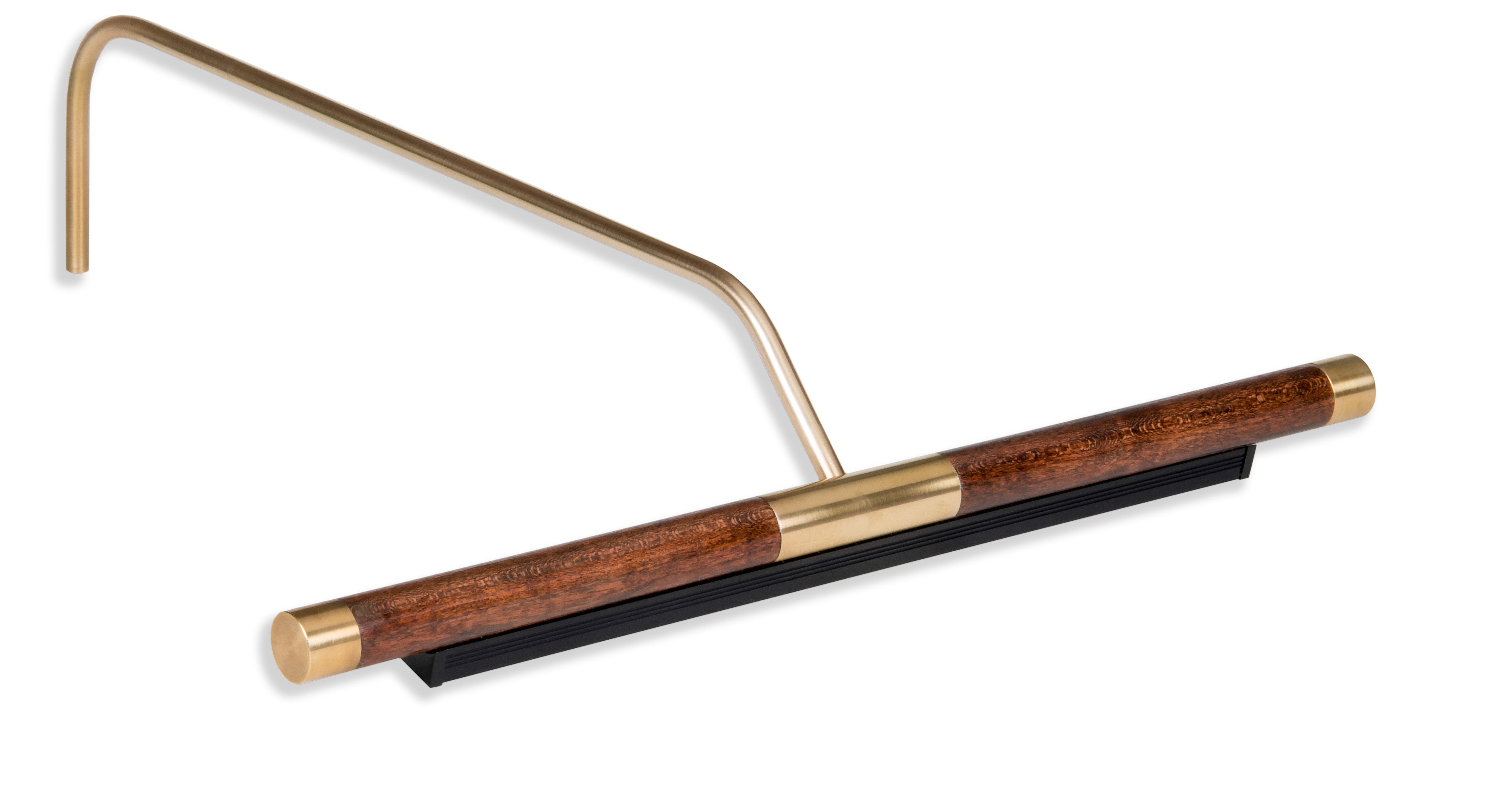
Another factor is whether your room is more modern in style or more traditional. This plays into the fixture choice as well since there are art lights with a modern flair (think silver) and those with a more conservative look (like solid mahogany with a brass end cap).
Long-Term or Short-Term Design
Do you like to change your decor on a frequent basis? Let’s say you like to change paint colors, purchase new furniture, or redesign your home regularly. In that instance, a more classic light fixture that can adapt to different styles may be the best choice for you.
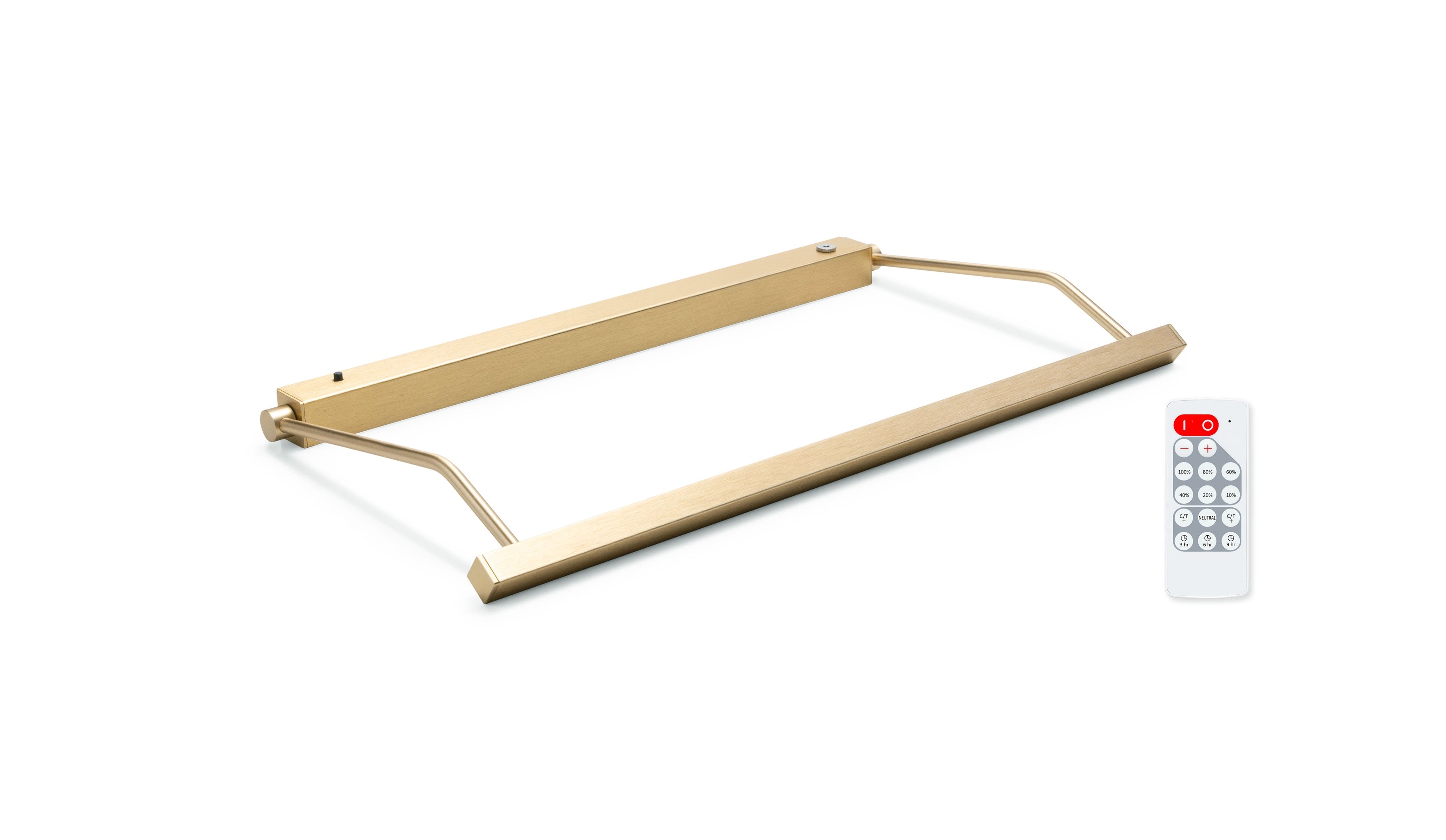
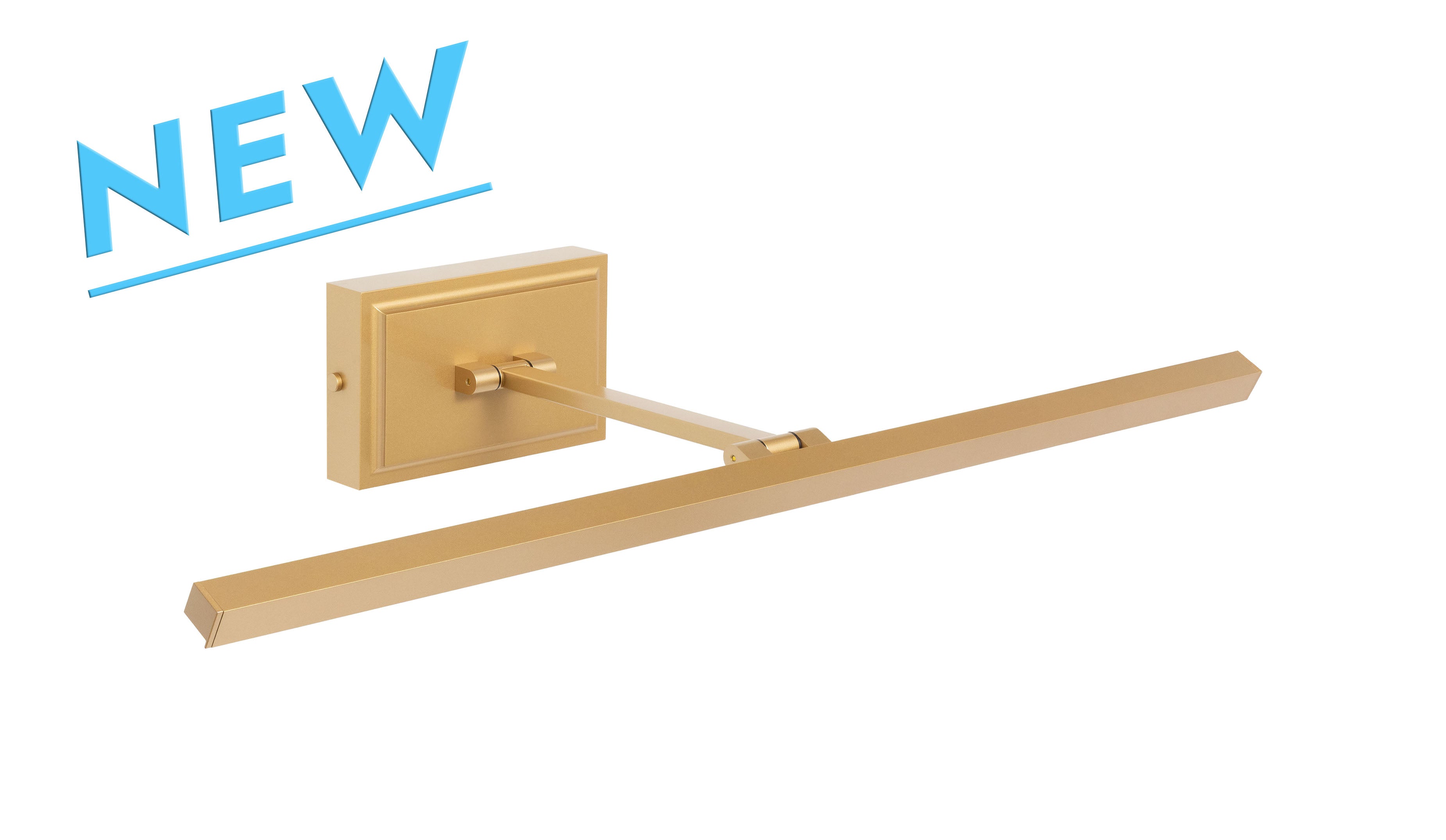
The same is true if you like to change your artwork. A versatile, simple, and classic light fixture like brushed brass would adapt easily to different locations and pieces of art.
Framed or Unframed
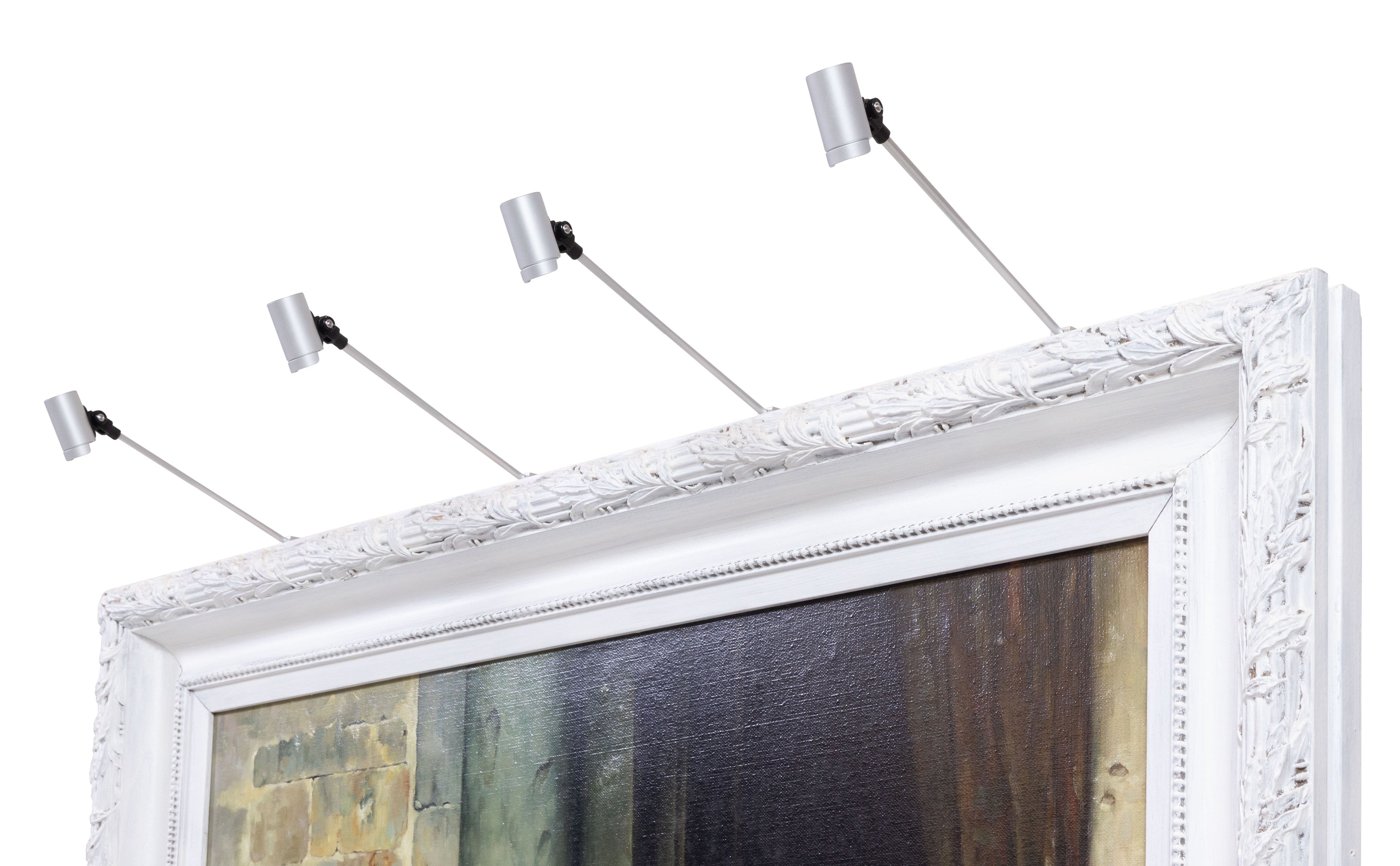
Whether your artwork is framed or unframed is important to take into consideration. If your artwork is framed, you should consider matching the finish of the fixture to the tones of the frame for a discreet presentation. Alternatively, if your artwork is unframed, you’ll want to coordinate with the tones of your artwork. For example, an unframed forest scene (earthy tones in the composition) may benefit from an antique bronze fixture, while a piece depicting a field of wheat (warm and yellow composition) would pair well with brushed brass. In both cases, you can choose an accent color in the artwork or nearby décor to have your picture light emphasize your personal style.
There Are No Wrong Answers
Having considered these factors, remember that design is particular to each person’s tastes. You will know what’s best for your art lighting and your room, and “there are no wrong answers.”
Discreet Presentation
If your art lighting is chosen to be a discreet illumination of the artwork, here are three choices:
1. Match to Frame
This is a conventional choice that provides a discreet presentation, lighting the artwork but not detracting from it. The frame and fixture blend together so the viewer should notice the artwork before the picture light. Choose the tone that best matches the frame.
2. Match to Tones of the Artwork
If your artwork is not framed, this is another traditional choice that offers the light as a cohesive presentation of the artwork. In this selection, the fixture finish is chosen in the closest match to the tones of the artwork.
3. Match to Wall Color
A third option is to pair the fixture color to the wall color, another minimal form of art lighting that ensures the fixture does not stand out from the artwork itself. This will work in both framed and unframed situations.
Accent to Artwork
Should you wish for your fixture to act as an accent piece, then the best option is a finish that ties into the other decor in the room:
1. Match to Hardware and Decor
Many frames utilize an accent color for style, such as a black frame with gold accents. Matching your art light to accents of a frame can provide a more stylized appearance. The same can be said for matching your fixture to surrounding hardware; you can use your light to complement nearby furniture or other lighting fixtures to have your fixture stand out relative to the artwork. The same is true if the artwork is unframed: match the art light fixture to existing decor.
2. Match to Accent Tones of the Artwork
If you’re looking for your art lighting fixture to stand out while still complimenting your artwork, matching your fixture to contrasting tones in the piece can achieve this goal.
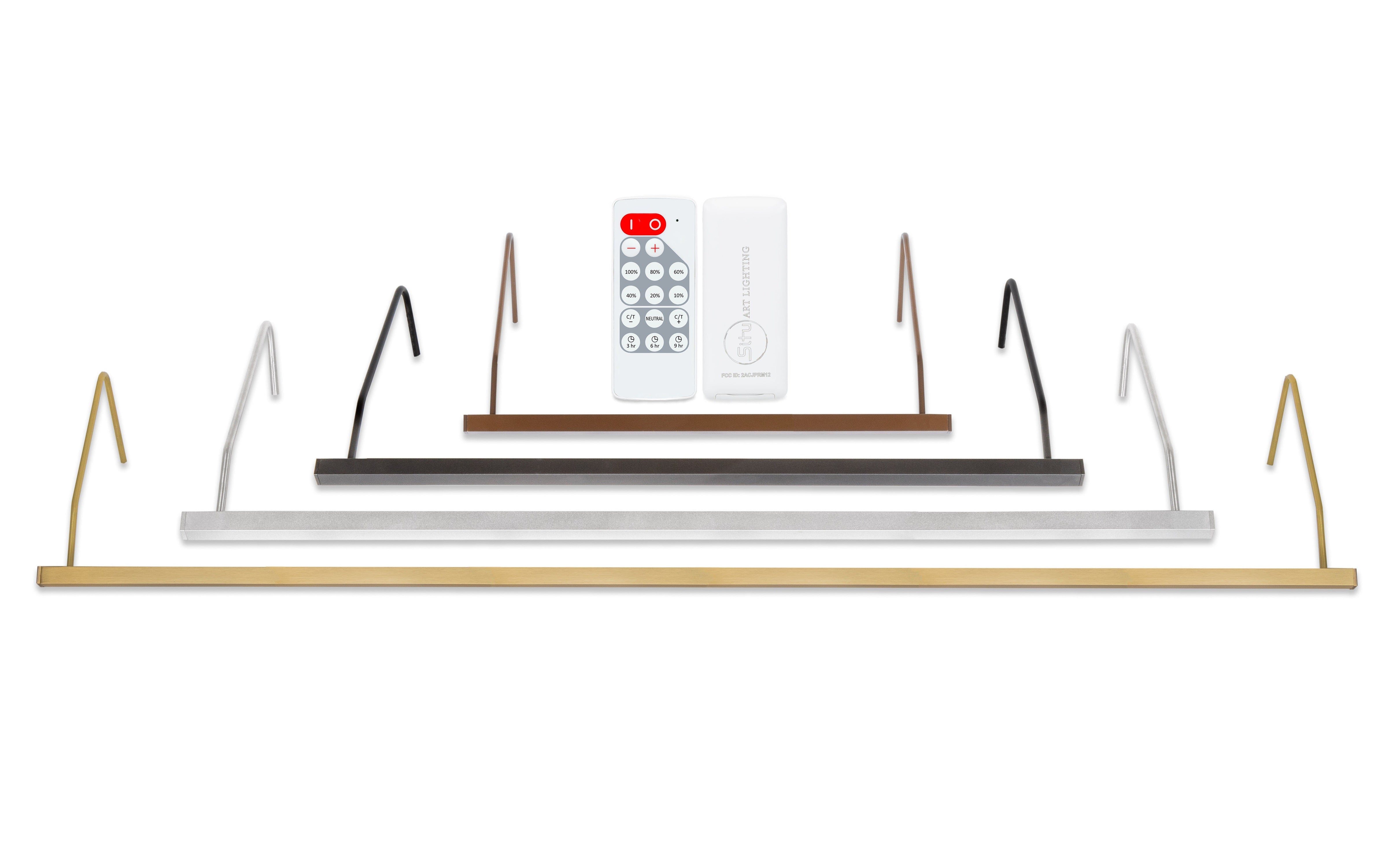
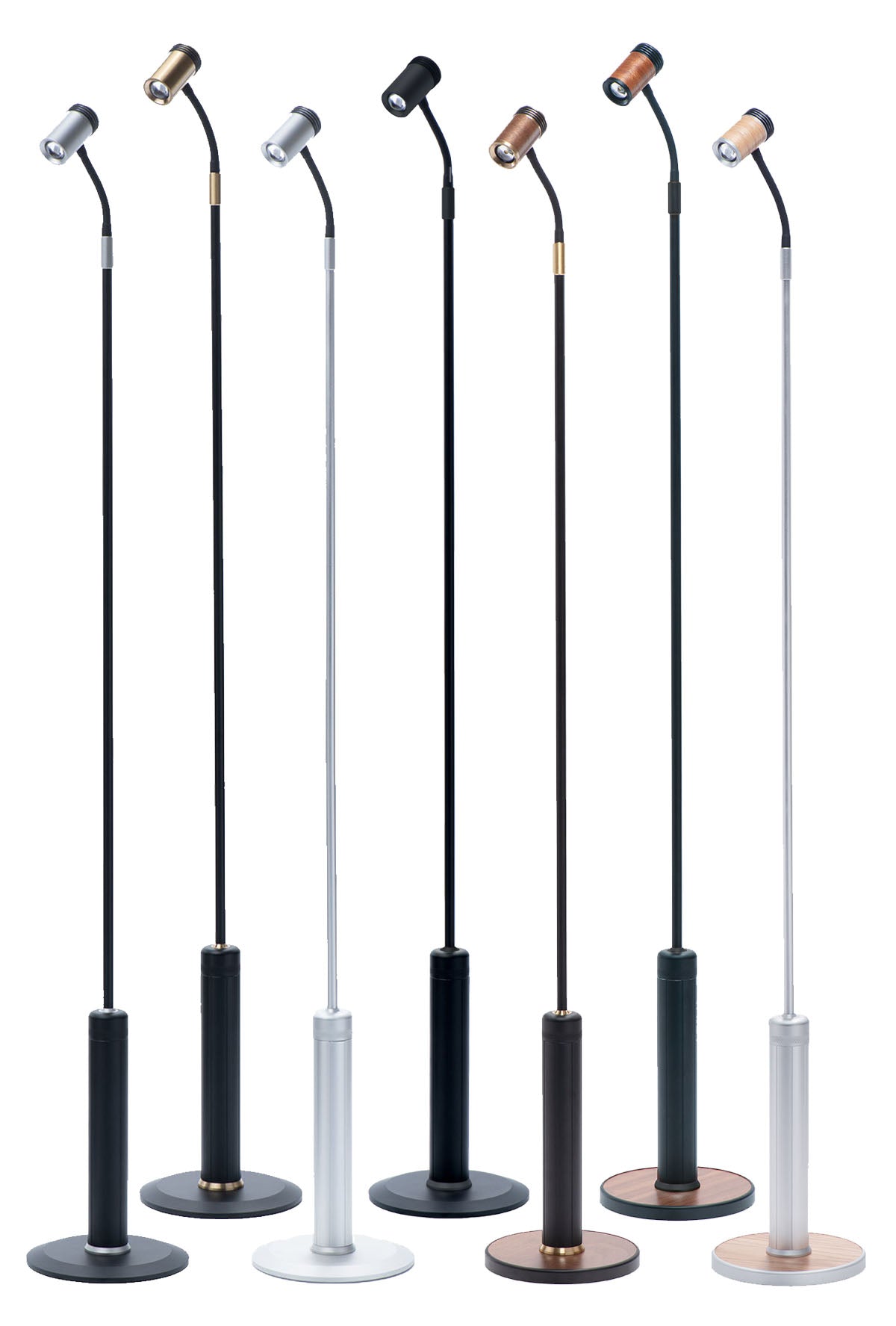
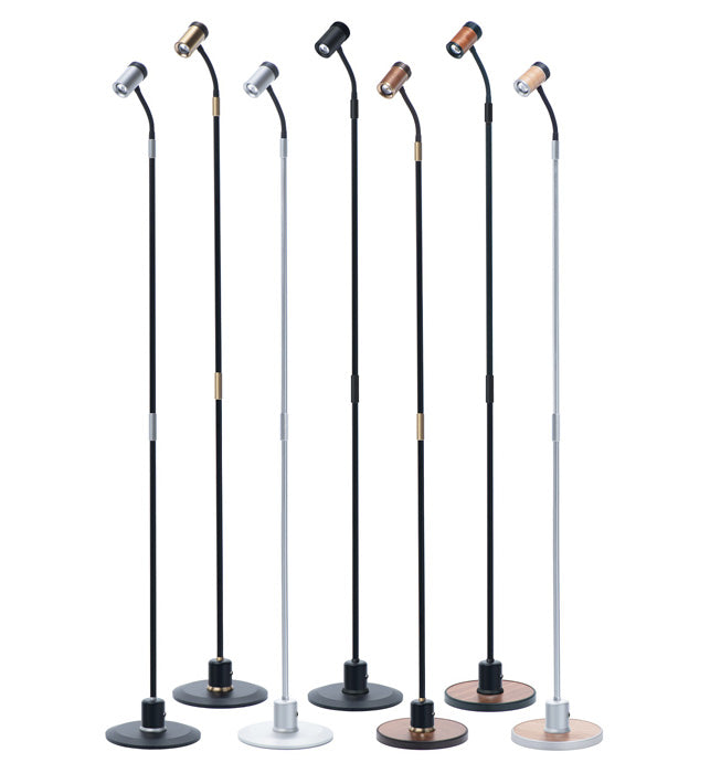
Common Lighting Finishes
If you’re still feeling overwhelmed by the many choices of lighting for artwork, here are some general guidelines to get you started:
- Gold or gilded frame: looks great with Brushed Brass.
- Brown or dark wood frames: Antique Bronze is a good choice.
- Lots of dark bronze and industrial inspiration: Oil Rubbed Bronze.
- Black frames or minimalist decor: go with Black.
- Silver or gray frames: choose Silver.
- White frames, coastal decor, or very light walls: White works well.
Is your artwork unframed?
-
Brushed brass goes well with bright, warm colors, such as sunrise/sunset scenes or a field of wheat.
- Antique bronze accents earthy or woodsy scenes and artwork with brown tones well.
- Oil-Rubbed Bronze offers the same dramatic presentation as Black, but with a softer feel.
- Black will complement stark night scenes or black and white photographs.
- Silver is also a good choice for unframed pieces with cool tones, like the blues and greens of a seascape.
- White is ideal to disappear into light wall or provide an airy accent to a light painting.
Lighting the Way
With the different factors to consider in lighting for art, it’s not always easy to know what finish to select for a fixture. At Situ Lighting, we have options from modern to traditional, small to large, all in numerous finishes. You can see all of our available finishes here.
We review pictures and dimensions of client artwork daily to make recommendations, so don’t hesitate to give us a call at 1-800-561-0492 or email us at info@situlighting.com.