Dark-toned artwork is among the most technically demanding to light well. The properties that make it compelling, deep blacks, rich tonal layering, complex shadow relationships, are exactly the properties that poor lighting destroys first. Insufficient output leaves the work invisible. Excessive output flattens the tonal range and washes out the shadow detail that gives the piece its character. The margin between those two outcomes is narrower than it is for brighter work, which is why the decisions around fixture selection, color rendering, and placement matter more here than in almost any other context.
What follows is a guide to those decisions, informed by years of working with collectors, designers, and institutions on exactly this challenge.
Understand What the Medium Actually Does With Light
Not all dark-toned artwork behaves the same way under illumination, and the differences are significant enough to influence fixture selection. An oil painting dominated by deep earth tones and impasto texture interacts with directional light in ways that a dark-field photograph or a charcoal drawing on paper does not. The raised surface of impasto catches light at an angle, creating dimension across shadowed passages and making brushwork visible that would otherwise recede into the darkness of the composition. For work like this, a directional source positioned to enhance that surface relief is not just desirable but essential to the viewing experience.
Photography, works on paper, and charcoal drawings present a flatter surface where the tonal relationships within the image carry all of the depth. Here, even illumination across the full surface is the priority, because any brightness variation introduced by the fixture will compete with the tonal values the artist established. A small hot spot at the center of a large dark photograph will be immediately visible and difficult to ignore. Glazing introduces a further complication: dark surfaces behind glass or acrylic behave like mirrors, and the proximity and geometry of the light source become the primary tools for controlling what reflects back toward the viewer.
Brightness and Visibility Are Not the Same Thing
The instinct when confronted with a dark piece that isn’t reading well is to add more light. In most cases this makes things worse, not better. Increasing raw output without attention to distribution, color rendering, and beam control tends to compress the tonal range rather than open it up. Shadow detail is lost first. The rich layering within the darker passages of the work flattens toward a uniform darkness, and the subtle distinctions between near-black and true black that give a well-painted canvas its depth disappear entirely.
What dark-toned artwork actually needs is controlled illumination distributed evenly across the surface, at an output level sufficient to reveal tonal variation without reaching the threshold where shadow detail is lost. That threshold varies by medium and palette, which is one reason why a one-size-fits-all approach to fixture selection rarely serves a serious collection well. The goal is to light the darkness, not to eliminate it.
Color Rendering Is More Critical Here Than Anywhere Else
The consequences of poor color rendering can be more visible in dark-toned work than brighter compositions. A light source with inadequate CRI will fail to distinguish between deep navy and charcoal, between warm dark brown and cool near-black, between the subtle greenish undertone in a shadow and the purple-black beside it. These distinctions are often what a skilled artist spent the most care creating, and a low-CRI source renders them invisible.
A source at 93 CRI or above reproduces the full spectral range of what it illuminates with a fidelity that makes those subtle color relationships legible. Deep blues retain their distinction from neighboring dark grays. Rich dark browns read as warm rather than simply dark. The chromatic complexity within a shadowed passage of paint becomes visible rather than collapsing into a single undifferentiated darkness. For collectors working with significant dark-toned pieces, this level of color rendering is not optional. It is the difference between seeing the work and seeing a degraded version of it.
Color Temperature Interacts With Dark Palettes in Ways Worth Understanding
Color temperature selection matters for any artwork, but its effect on dark-toned pieces is worth specific attention. A warmer source in the 2700K to 3000K range deepens the warmth of dark earth tones, enriches ochres and dark umbers, and creates an atmosphere of controlled intimacy that suits work in the Rembrandt tradition or any painting with a strong chiaroscuro quality. This is often the right choice for traditional oil paintings with dark grounds and warm shadow passages.
A cooler source can shift the reading of a dark composition significantly. Cool tones tend to make dark blues and grays read as more graphically distinct and contemporary, which suits certain photographic work and some modern painting. The risk is that a cooler temperature can make warm-toned shadow passages feel leaden or flat. When in doubt, a neutral temperature around 3000K offers the broadest versatility across dark-toned palettes and avoids committing the reading of the work too firmly in either direction.
Glare and Reflection Are Amplified With Dark Work
Dark surfaces are inherently more reflective than light ones. A viewer standing in front of a large dark painting or photograph will see the room reflected back at them far more readily than they would with a lighter work, and that reflection competes directly with their ability to see the artwork itself. This is a physics problem as much as a lighting problem, and the solution involves both fixture selection and placement.
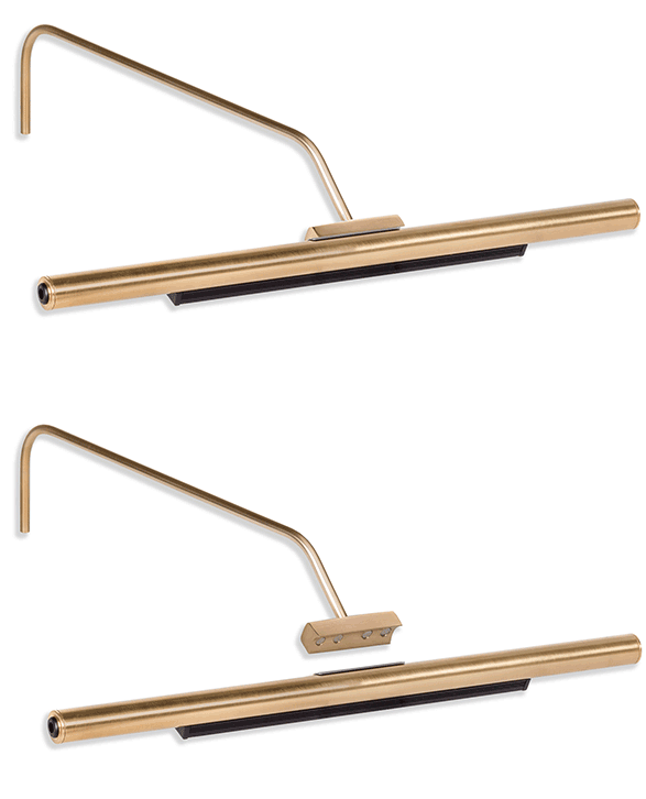
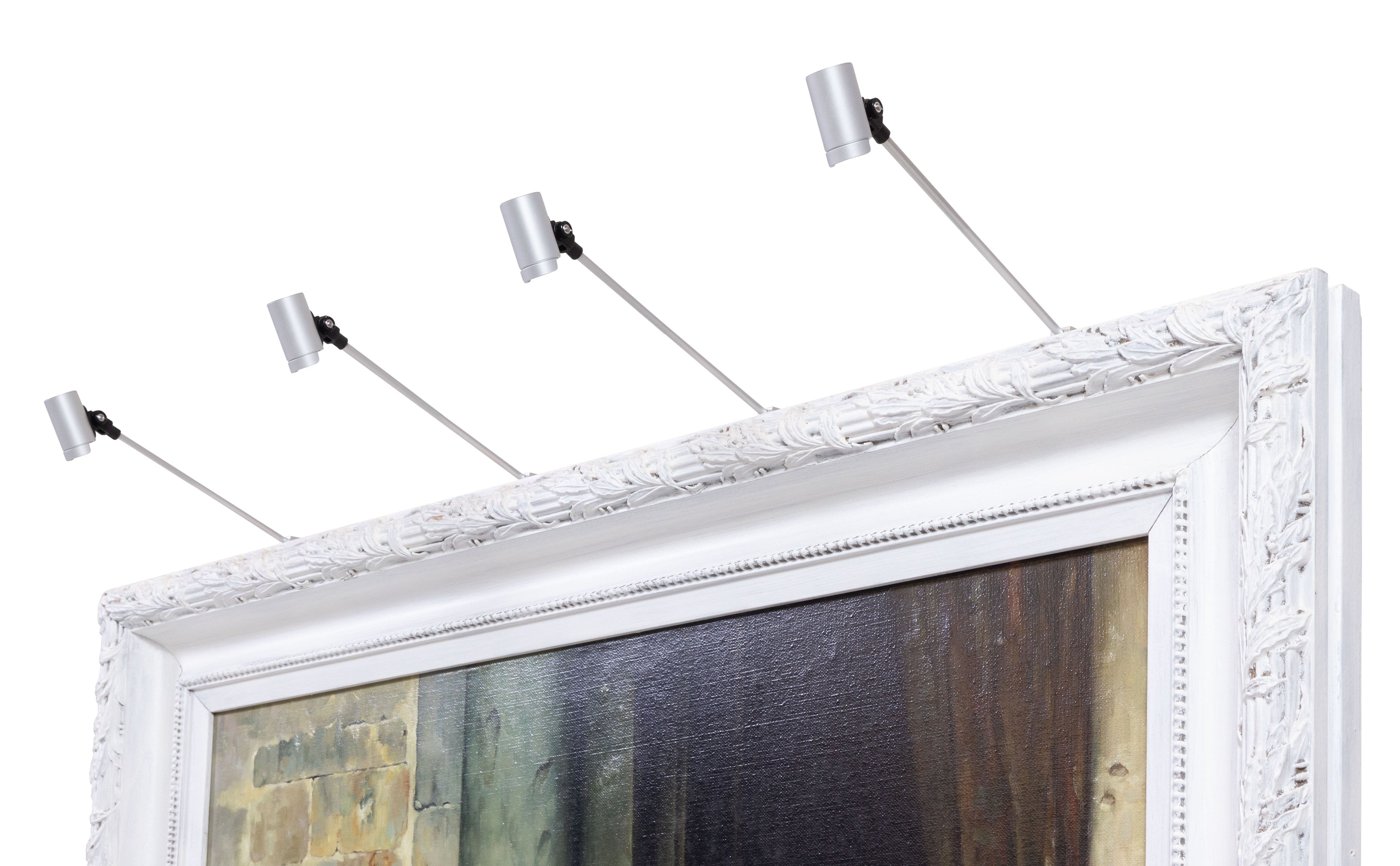
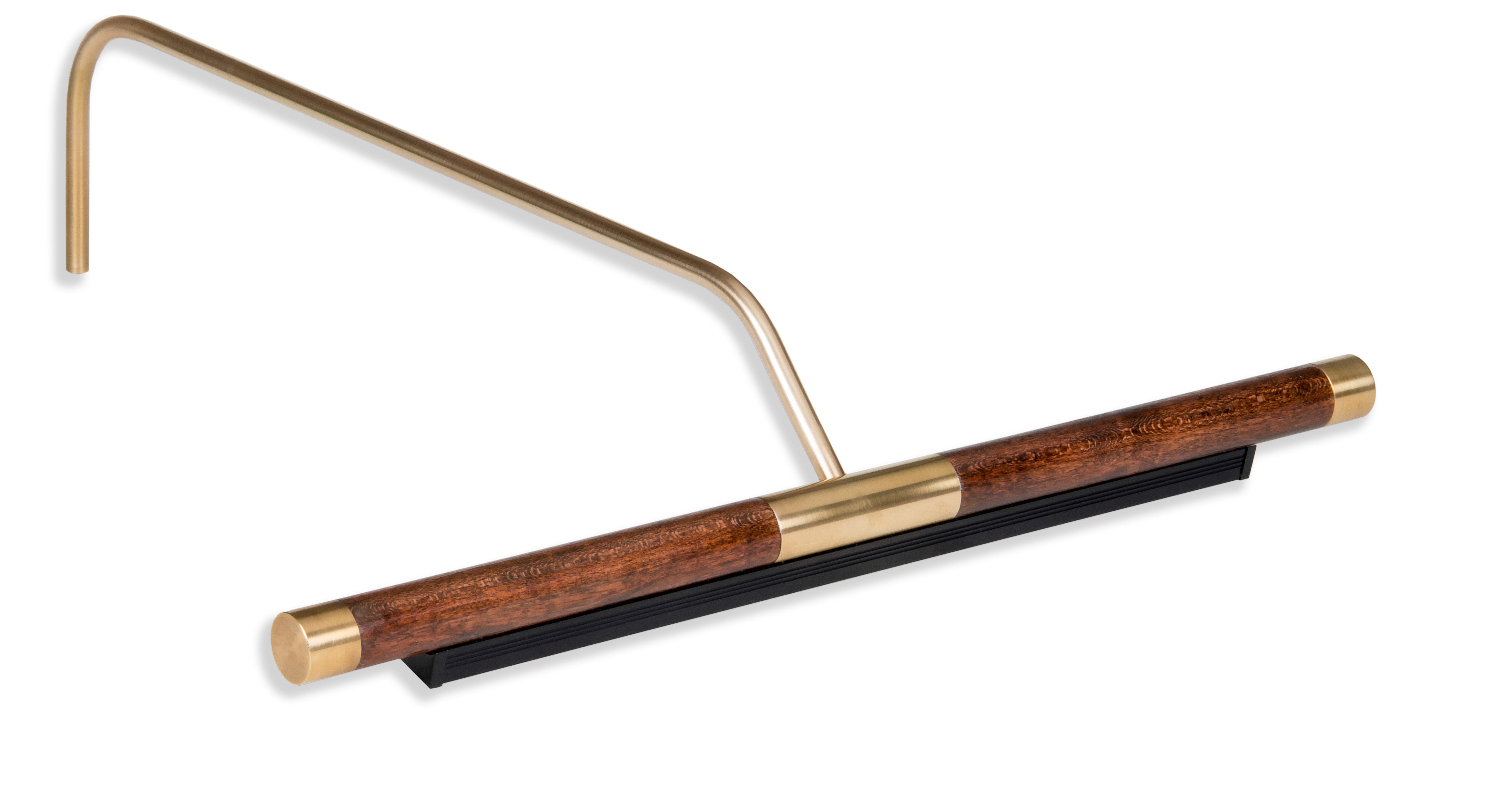
Picture lights have a meaningful advantage in this context. Mounted above and close to the canvas surface, they direct illumination downward across the face of the work at an angle that minimizes the geometry of specular reflection toward a standing or seated viewer. Ceiling-mounted sources positioned further from the wall introduce more oblique reflection angles that can be harder to control. For glazed dark works specifically, the picture light’s proximity and beam direction make it the most practical tool for managing the mirror-like qualities of the surface.
The Wall and Environment Around the Work Change Everything
Dark-toned artwork interacts with its surrounding environment differently than lighter work, and those interactions deserve deliberate attention. Displayed against a similarly dark wall, a dark painting can achieve a seamless, gallery-like continuity where the artwork feels like it inhabits the wall rather than hanging on it. This is a sophisticated presentation choice that many serious collectors favor, and it requires lighting that defines the composition without creating a harsh boundary between the canvas and the surface behind it.
Against a light wall, the same piece will read more graphically, with stronger contrast between the work and its surroundings. Neither approach is wrong, but the lighting strategy should reflect the choice. Ambient room lighting also matters here more than it might with a brighter piece. A dark canvas illuminated by a dedicated picture light against a very dark, unlit wall can create an intensity that suits some work and overwhelms others. When ambient lighting is calibrated to complement rather than compete with the picture light, the artwork reads as part of the room rather than a void within it.
The Frame Is Part of the Optical System
The frame is not separate from the lighting consideration. It is part of the optical system that determines how light reaches the canvas and how the overall presentation reads. Highly reflective metallic finishes redirect light toward the viewer and can create distracting secondary light sources. Dark wood frames absorb light at the edges of the composition, which can reinforce the contained, dramatic quality of a dark-toned piece but also risks making the transition from frame to canvas difficult to read at low illumination levels.
Why Fixture Quality Matters More With Dark-Toned Work
The narrower margin between under and overexposure in dark-toned work means that the quality of the light source itself carries more consequence than it does with brighter pieces. Not all LED art lights are built to the same standard, and the differences become most visible on exactly this kind of work. Spectral consistency, beam uniformity, and the accuracy of color rendering across the full output range all influence whether a dark-toned piece reads with depth and presence or simply appears dark.
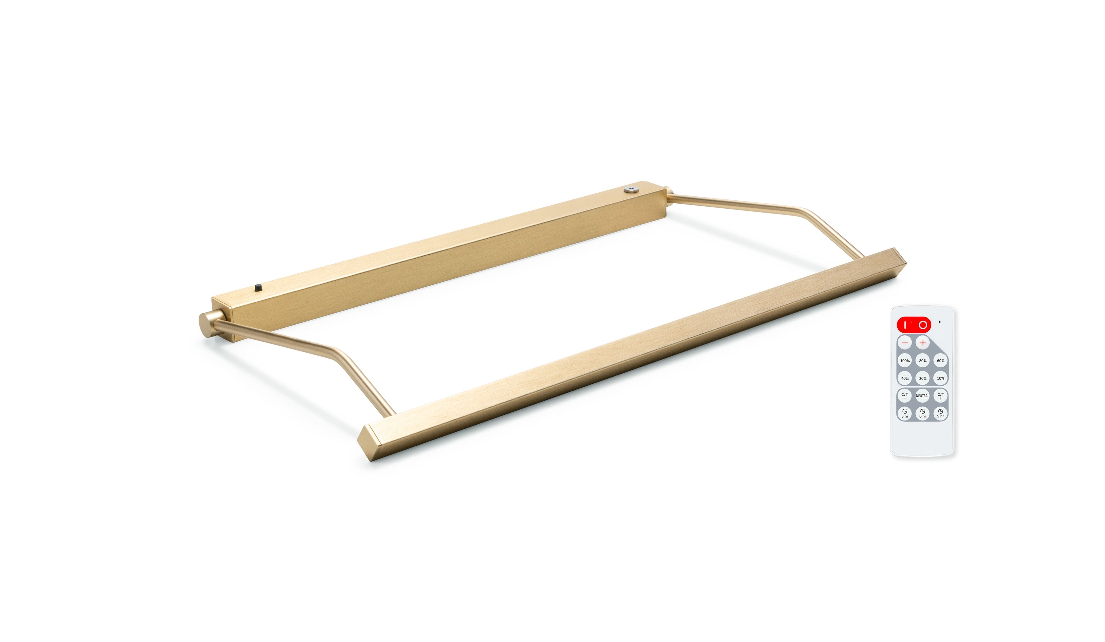
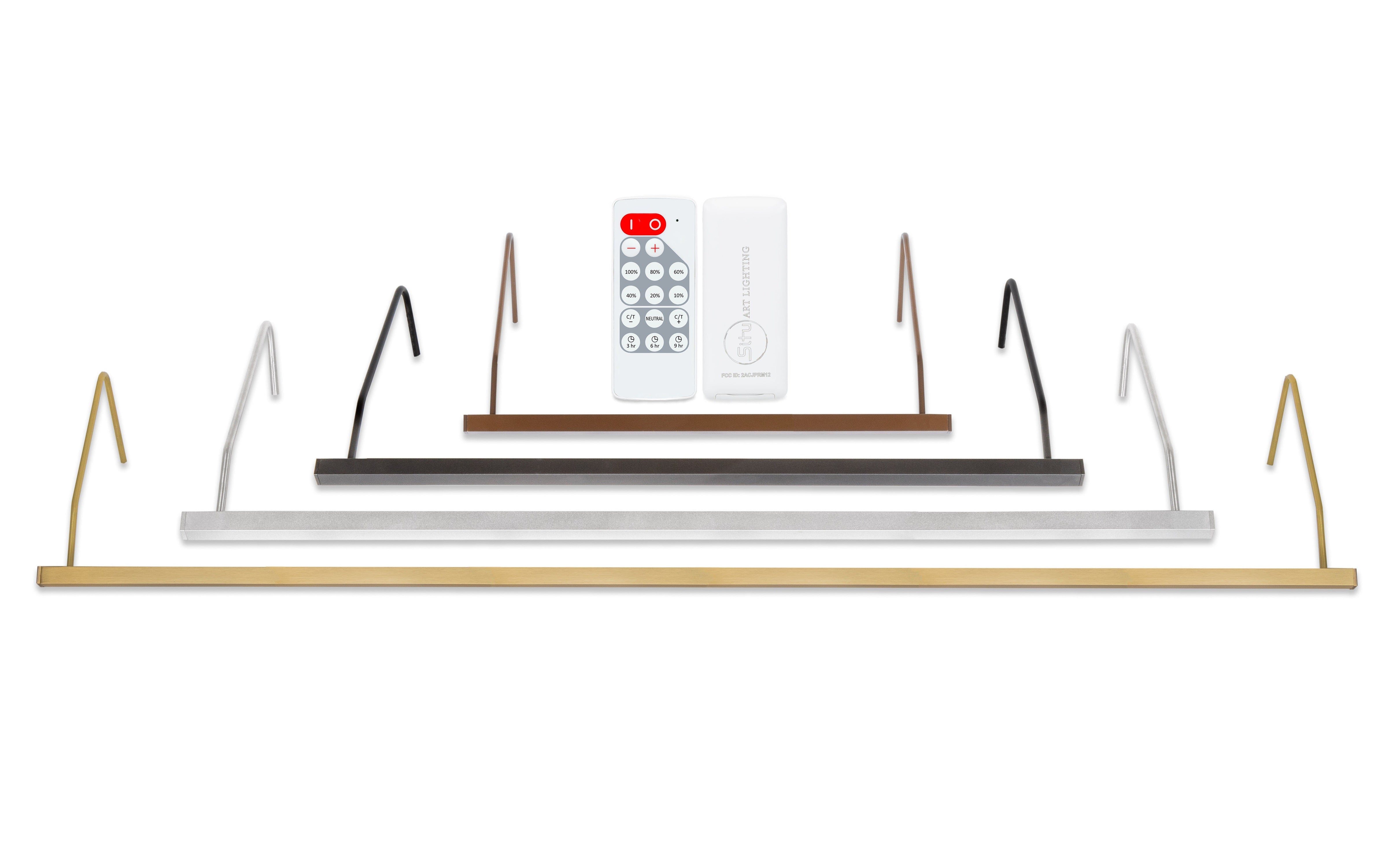
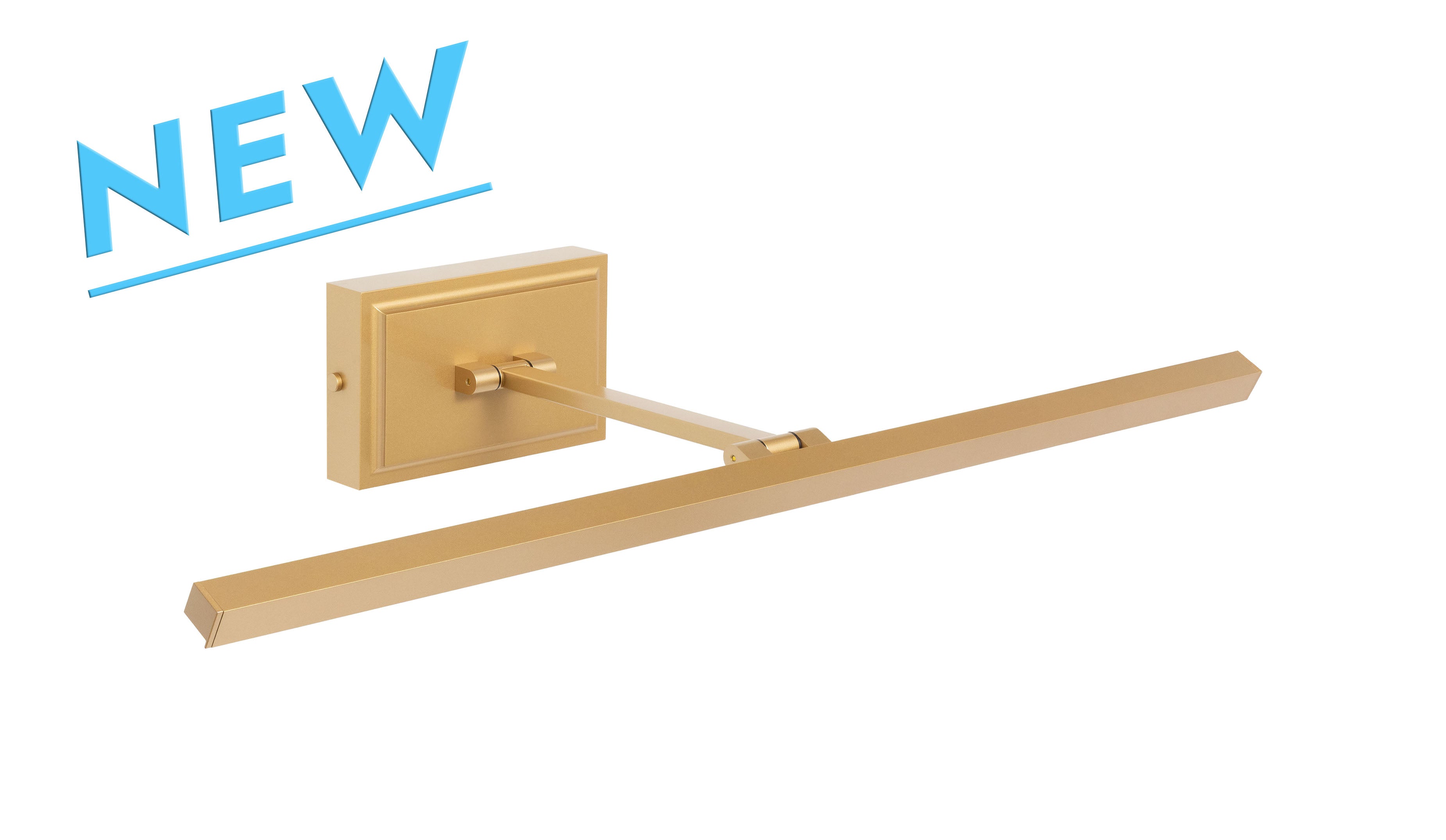
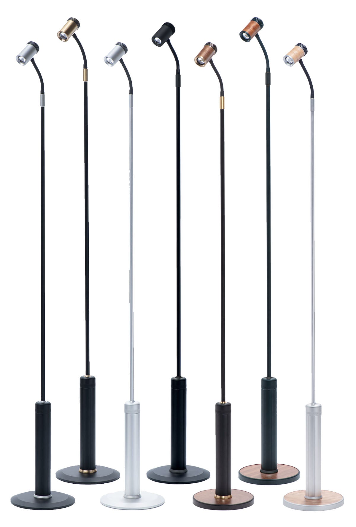
Our LED art lights are built around high-CRI emitters selected specifically for their performance across dark and complex palettes, with beam geometry engineered to deliver even coverage from edge to edge of the canvas. For dark-toned work in particular, that engineering is not incidental. It is the difference between a fixture that reveals the work and one that simply illuminates the wall around it.
Light With the Darkness, Not Against It
Dark-toned artwork rewards the collector who approaches lighting with the same seriousness applied to the acquisition itself. The tonal complexity, the shadow relationships, and the chromatic subtlety within a well-executed dark piece are all the product of deliberate decisions by the artist, and they deserve a lighting solution precise enough to reveal them.
If you are working through these decisions for a specific piece and would benefit from a specialist’s perspective, our team is here to help. Share the work with us and we’ll identify the right fixture for your medium, your space, and your installation. Thousands of collectors, designers, and institutions trust us to get it right.