Most artwork is not poorly lit because of a deficient fixture. It is poorly lit because of decisions made before a fixture was ever installed. Poor placement, mismatched color temperature, inadequate CRI, the wrong beam angle, or simply the wrong source entirely; these are the variables that determine whether artwork reads with depth and presence. The mistakes below are the ones we see most consistently, and most of them are straightforward to correct.
Using General Room Lighting Instead of Dedicated Picture Lighting
This is the most common mistake and the one with the largest impact. Ceiling fixtures, recessed downlights, and floor lamps illuminate rooms. They were not designed to illuminate artwork. General room lighting produces flat, undifferentiated illumination that flattens tonal relationships, reduces apparent texture, and fails to direct the viewer's attention toward the work.
Purpose built art lighting instruments are designed around a specific task: revealing what the artist put into the work. Proper beam geometry, high CRI output, and close mounting position all contribute to a result that general lighting simply cannot replicate. Collectors who upgrade from room lighting to dedicated picture lighting consistently describe the experience as seeing their artwork for the first time.
Choosing a Fixture Based on Lumen Output Rather Than Coverage
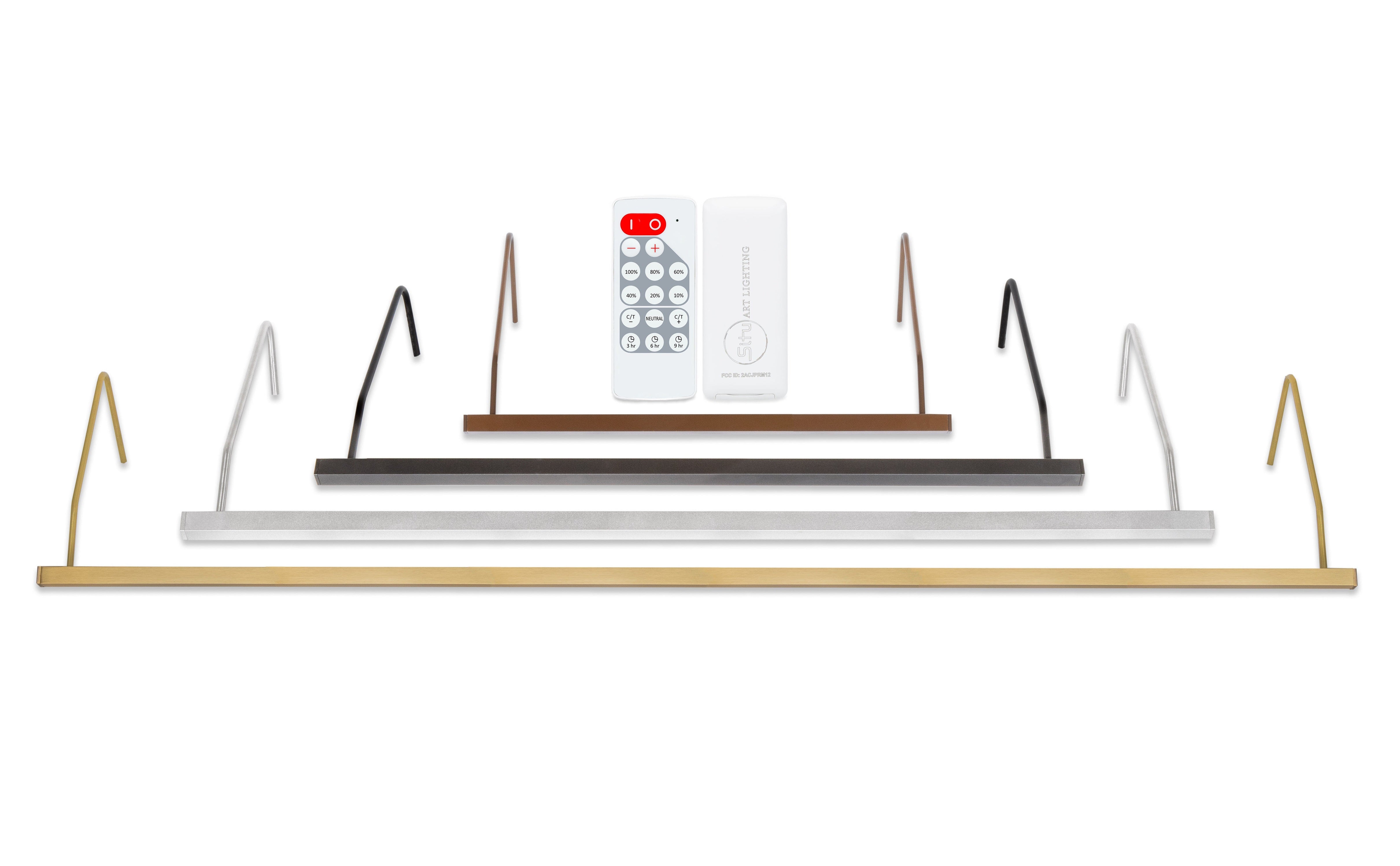
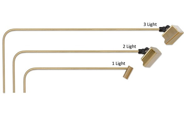
Lumen output tells you how much light a fixture produces. It does not tell you how that light is distributed across a specific canvas from a specific distance. A high-lumen fixture with poor beam geometry will produce uneven coverage with a bright center and dark edges. A lower-output fixture with well-engineered optics can outperform it entirely.
Recommended artwork size is a more useful specification than lumen output for this reason. It reflects actual tested performance across the full combination of beam geometry, optics, and mounting position. For collectors who want the underlying numbers, lumen output is available in the cut sheets within the Tech Specs section of each product page.
Ignoring Color Rendering Index
CRI measures how accurately a light source renders the full spectrum of colors in what it illuminates. A source below 93 CRI may fail to distinguish between deep navy and charcoal, between warm dark brown and cool near black, between the greenish undertone in a shadow and the purple-black beside it. These distinctions are often where a skilled artist invested the most care, and a low-CRI source renders them invisible.
This applies equally to general room fixtures, older halogen picture lights, and early LED art lights. CRI is not a premium specification reserved for institutional installations. It is the baseline standard for any fixture claiming to serve as picture lighting. If the current source has low CRI, the artwork is being seen through a filter that distorts it in ways that are difficult to articulate but immediately apparent under comparison.
Selecting the Wrong Color Temperature for the Medium
Color temperature selection is often made once, at the point of purchase, without much deliberation, and then lived with indefinitely. A source that is too cool flattens warm-toned oil paintings, makes earth tones read as gray, and strips the intimacy from work that depends on warmth to read as intended. A source that is too warm muddies cool palettes, obscures blues and greens, and makes photography read as artificially golden.
For most traditional oil paintings and works with rich earth tones, a source in the 2700K to 3000K range is appropriate. Photography, contemporary work, and cooler palettes generally suit 3000K to 3500K. Color temperature mismatches cannot be resolved by repositioning or increasing output. They require choosing the right source for the medium from the outset. Fixtures with color-tuning functionality offer the flexibility of 2700-4000K selection at any time.
Using a Fixture That Is Too Small for the Artwork
An undersized fixture produces a predictable result: a bright horizontal band near the top of the canvas with diminishing coverage toward the lower edge and sides. This is especially visible on larger and taller works, where the gap between what the fixture covers and what the canvas requires becomes impossible to ignore.
Tall works require attention to vertical coverage as well as horizontal. A medium beam angle from a properly sized bar carries illumination further down the face of the work than a narrow beam would from the same mounting position. Fixture selection should follow from the artwork, not precede it.
Placing the Fixture in the Wrong Position
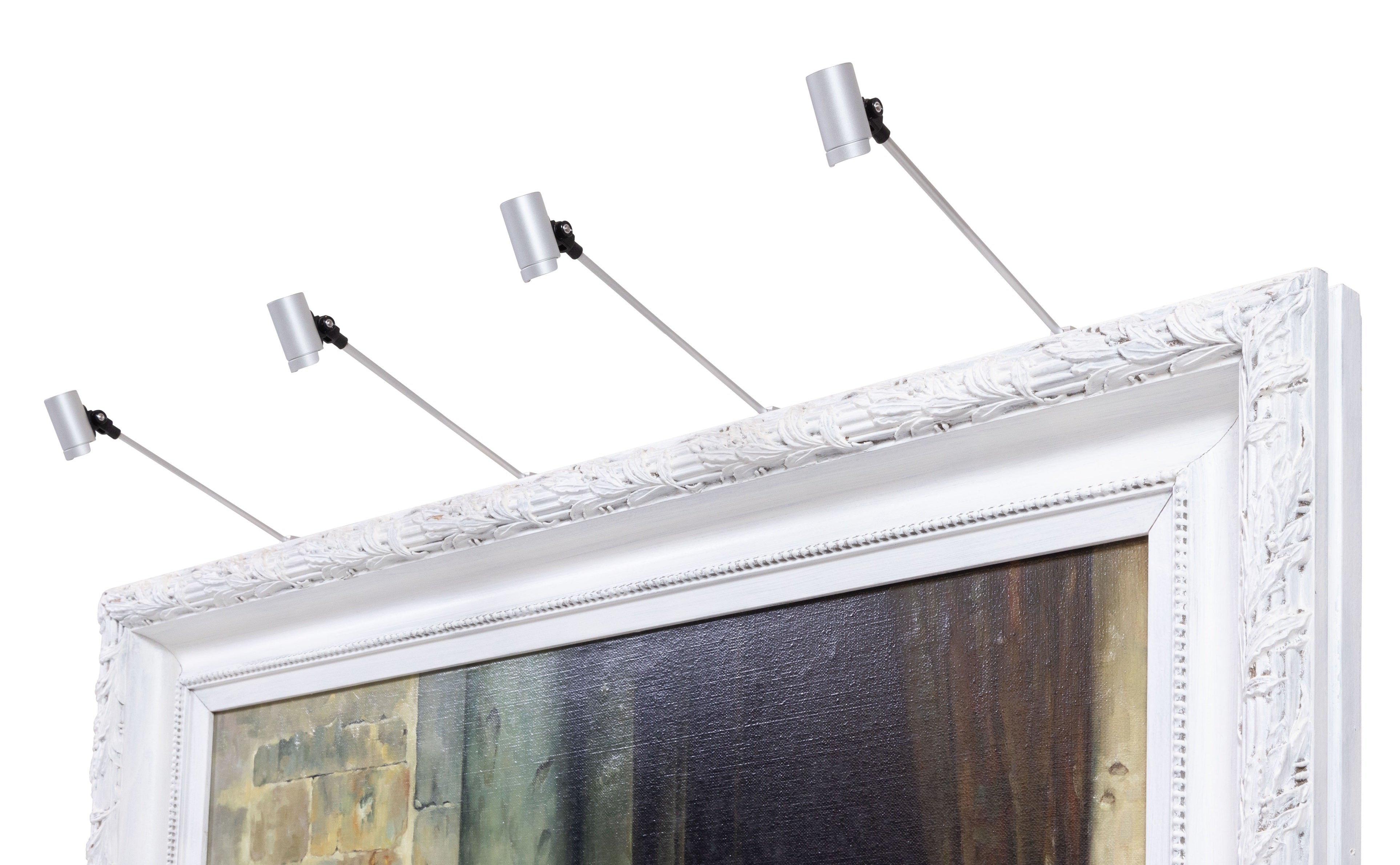
Fixture placement influences the final result as much as fixture selection. Mounted too far from the wall, the arm angle increases and glare geometry becomes more problematic, particularly on glazed work. Mounted too low on the frame, the beam strikes the canvas at an angle that creates uneven illumination and can emphasize texture in ways that distort rather than reveal.
The standard recommendation is to position the fixture above the top of the frame, centered on the canvas width. From there, small adjustments to height and pivot position can address specific coverage or glare issues. Viewing the artwork from multiple positions in the room before finalizing placement is always worth the time.
Allowing Wiring Constraints to Drive Poor Placement Decisions
One of the most underappreciated causes of poor art lighting is letting outlet location determine fixture placement. Artwork ends up on a wall not because it is the right wall for the piece, but because there is a nearby outlet. The fixture then goes where the outlet is placed rather than where the work deserves to be.
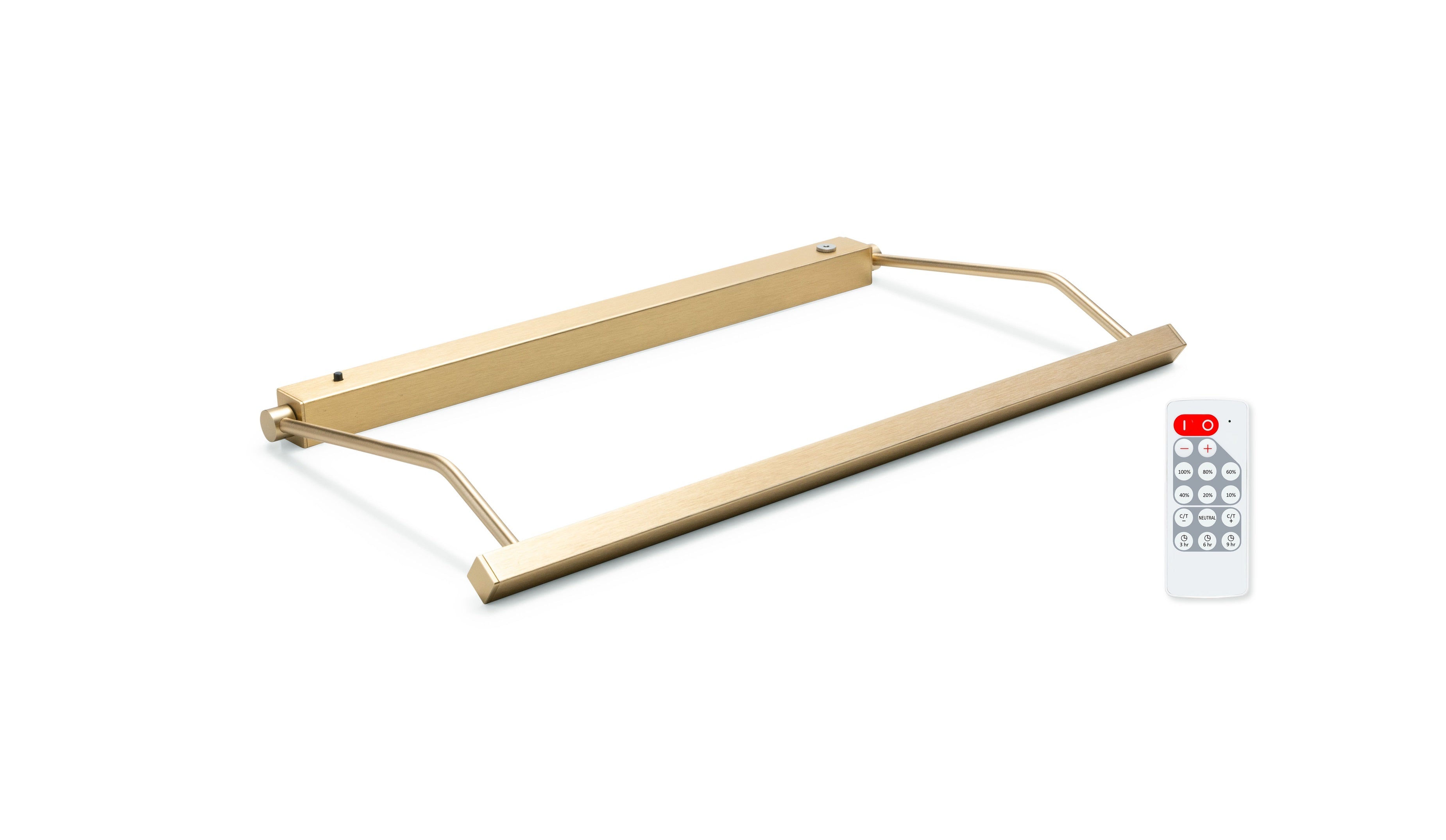
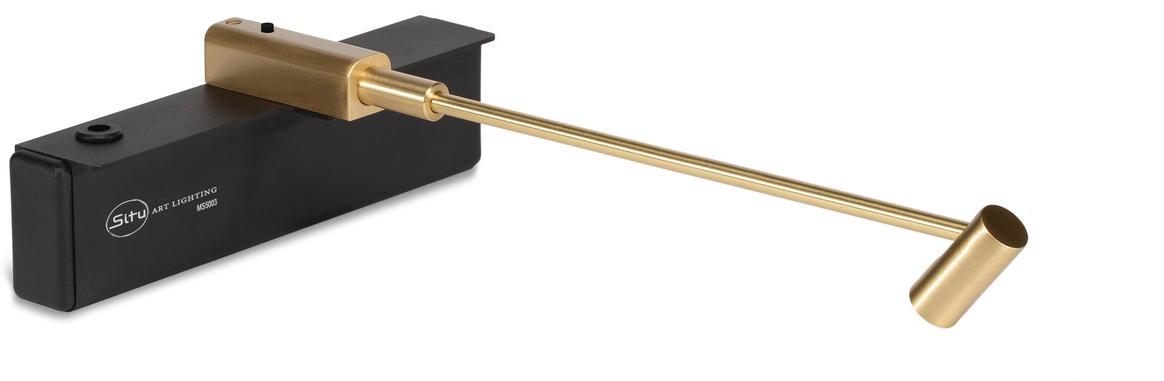
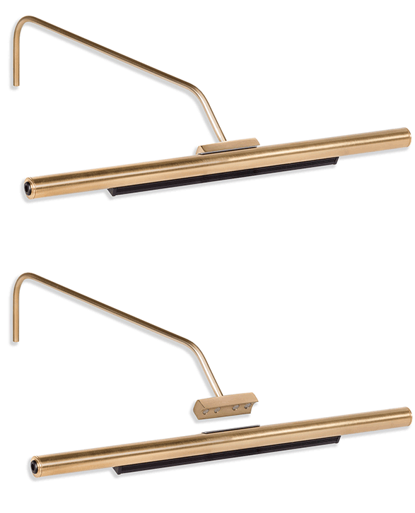
Rechargeable battery picture lights remove this constraint entirely. The fixture mounts where the artwork and the design require it, independent of outlet location. Each fixture removes from its mount in seconds with one hand and no tools for convenient recharging. For collectors who move work between spaces or rotate collections, wireless installation also makes repositioning practical rather than disruptive.
Neglecting the Relationship Between Art Lighting and Ambient Light
A dedicated picture light does not operate in isolation. The room around it shapes how the artwork reads. A warm picture light beside cool overhead fixtures creates a color temperature conflict that both sources feel rather than just one. A brightly lit room around a modestly lit canvas reduces the visual contrast that makes dedicated art lighting effective.
Calibrating the picture light in relation to the ambient environment produces more resolved results. Dimming the surrounding room slightly during evening viewing amplifies the impact of the dedicated fixture without changing it. Matching color temperature across both sources (when the composition allows) creates visual coherence that the viewer registers without identifying. These are small decisions with disproportionate results.
Treating Lighting as a Finishing Step Rather Than a Design Decision
The most consequential mistake is also the most systemic: treating art lighting as something to address after everything else is decided. Artwork is acquired, framed, and hung. Then, eventually, someone considers adding a light. By that point, outlet locations are fixed, wall placement has been determined by other factors, and the fixture selection happens under constraints that could have been avoided entirely.
Lighting considered alongside placement, framing, and wall selection produces better outcomes at every stage. It shapes which wall gets the work, how high it hangs, what glazing is appropriate, and which fixture serves it well. The collectors, designers, and institutions who treat lighting as part of the display decision from the beginning consistently arrive at results that the retrofit approach rarely matches.
If you are working through these decisions for a specific piece or a collection and would benefit from a specialist's perspective, our team is here to help. Thousands of collectors, designers, and institutions trust us to get it right.